Overlays
Overlays (powered by the Sling Resource Merger) are AEM's mechanism for customising or extending
the product UI without modifying the original files under /libs. By recreating a file with the
same path under /apps, Sling merges your version with the original, letting you add, modify, hide,
or replace individual nodes and properties.
This is how you customise the AEM Touch UI -- navigation items, console columns, dialog fields, toolbar actions, and more.
How the Sling Resource Merger Works
The Sling Resource Merger is active by default in AEM. When a resource is requested, Sling checks
both /apps and /libs (in that order) and merges them:
| Scenario | Behaviour |
|---|---|
Node exists only in /libs | Used as-is (product default) |
Node exists only in /apps | Added to the merged result |
Node exists in both /libs and /apps | /apps version wins (properties merged, /apps takes precedence) |
Node in /apps has sling:hideResource=true | Node is hidden from the merged result |
Node in /apps has sling:hideChildren | Specified child nodes are hidden |
Node in /apps has sling:orderBefore | Controls the order of the node relative to siblings |
Merger properties reference
| Property | Type | Purpose |
|---|---|---|
sling:hideResource | Boolean | Hides this node entirely from the merged result |
sling:hideChildren | String[] | Hides specific child nodes by name (e.g., [child1, child2]) |
sling:hideProperties | String[] | Hides specific properties from the merged result |
sling:orderBefore | String | Places this node before the named sibling in the merge order |
Creating an Overlay
Via CRXDE Lite
- Navigate to the node you want to overlay in CRXDE Lite (e.g.,
/libs/cq/core/content/nav) - Right-click the node and select Overlay Node
- Confirm the target path (
/apps/cq/core/content/nav) - CRXDE creates the matching structure under
/apps - Modify the overlay as needed
Via your project code
For deployment via your Maven project, recreate the same directory structure under ui.apps:
ui.apps/src/main/content/jcr_root/
└── apps/
    └── cq/
        └── core/
            └── content/
                └── nav/
                    └── .content.xml    ← Your overlay
Add the path to your filter.xml:
<filter root="/apps/cq/core/content/nav" mode="merge"/>
Always use mode="merge" in your filter for overlays. Using the default mode="replace" would
delete all product nodes not present in your overlay, potentially breaking the UI.
Practical Examples
Hide main navigation items
Hide unwanted items from the AEM homepage (http://localhost:4502/aem/start.html):
<?xml version="1.0" encoding="UTF-8"?>
<jcr:root xmlns:jcr="http://www.jcp.org/jcr/1.0"
          xmlns:nt="http://www.jcp.org/jcr/nt/1.0"
          xmlns:sling="http://sling.apache.org/jcr/sling/1.0"
    jcr:primaryType="nt:unstructured"
    id="root">
    <projects jcr:primaryType="nt:unstructured"
        sling:hideResource="{Boolean}true"/>
    <screens jcr:primaryType="nt:unstructured"
        sling:hideResource="{Boolean}true"/>
    <personalization jcr:primaryType="nt:unstructured"
        sling:hideResource="{Boolean}true"/>
    <commerce jcr:primaryType="nt:unstructured"
        sling:hideResource="{Boolean}true"/>
    <communities jcr:primaryType="nt:unstructured"
        sling:hideResource="{Boolean}true"/>
</jcr:root>
To find the node names of navigation items, inspect /libs/cq/core/content/nav in CRXDE.
Add a custom navigation button
Add a "HelpDesk" link to the AEM homepage navigation:
<?xml version="1.0" encoding="UTF-8"?>
<jcr:root xmlns:jcr="http://www.jcp.org/jcr/1.0" xmlns:nt="http://www.jcp.org/jcr/nt/1.0"
    jcr:primaryType="nt:unstructured">
    <helpdesk
        jcr:primaryType="nt:unstructured"
        jcr:title="HelpDesk"
        href="https://support.mycompany.com"
        icon="callCenter"
        order="{Long}1600"
        target="_blank"/>
</jcr:root>
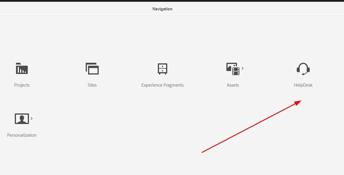
Adjust the order value to position the button (lower numbers appear first). Inspect
/libs/cq/core/content/nav to see the order values of existing items.
Customise Sites console columns
Add or remove columns in the Sites console list view:
<?xml version="1.0" encoding="UTF-8"?>
<jcr:root xmlns:jcr="http://www.jcp.org/jcr/1.0"
          xmlns:nt="http://www.jcp.org/jcr/nt/1.0"
          xmlns:sling="http://sling.apache.org/jcr/sling/1.0"
    jcr:primaryType="nt:unstructured">
    <!-- Hide the "Published" column -->
    <published jcr:primaryType="nt:unstructured"
               sling:hideResource="{Boolean}true"/>
    <!-- Add a custom column -->
    <template jcr:primaryType="nt:unstructured"
              jcr:title="Template"
              sortable="{Boolean}true"
              sling:orderBefore="published"/>
</jcr:root>
Overlay a dialog field
Change the default value or behaviour of a product dialog field. For example, modify the Core Component Image dialog to change a field label:
<?xml version="1.0" encoding="UTF-8"?>
<jcr:root xmlns:jcr="http://www.jcp.org/jcr/1.0"
          xmlns:nt="http://www.jcp.org/jcr/nt/1.0"
    jcr:primaryType="nt:unstructured">
    <content jcr:primaryType="nt:unstructured">
        <items jcr:primaryType="nt:unstructured">
            <tabs jcr:primaryType="nt:unstructured">
                <items jcr:primaryType="nt:unstructured">
                    <properties jcr:primaryType="nt:unstructured">
                        <items jcr:primaryType="nt:unstructured">
                            <!-- Only override the specific field you need to change -->
                            <alt jcr:primaryType="nt:unstructured"
                                 fieldLabel="Accessibility Text (required)"
                                 required="{Boolean}true"/>
                        </items>
                    </properties>
                </items>
            </tabs>
        </items>
    </content>
</jcr:root>
When overlaying dialogs, you only need to include the nodes on the path to the field you want to change. The Sling Resource Merger merges your changes with the original dialog. You do not need to copy the entire dialog XML.
Hide dialog fields with sling:hideChildren
Remove specific fields from an inherited or overlaid dialog without replacing the entire node:
<items jcr:primaryType="nt:unstructured"
       sling:hideChildren="[decorative,linkURL]">
    <!-- The "decorative" and "linkURL" fields from /libs will be hidden -->
</items>
Override page properties tabs
Add a custom tab to the page properties dialog:
<?xml version="1.0" encoding="UTF-8"?>
<jcr:root xmlns:jcr="http://www.jcp.org/jcr/1.0"
          xmlns:nt="http://www.jcp.org/jcr/nt/1.0"
          xmlns:sling="http://sling.apache.org/jcr/sling/1.0"
    jcr:primaryType="nt:unstructured"
    jcr:title="Social Media"
    sling:resourceType="granite/ui/components/coral/foundation/container"
    sling:orderBefore="cloudservices">
    <items jcr:primaryType="nt:unstructured">
        <ogTitle jcr:primaryType="nt:unstructured"
                 sling:resourceType="granite/ui/components/coral/foundation/form/textfield"
                 fieldLabel="OG Title"
                 name="./ogTitle"/>
        <ogDescription jcr:primaryType="nt:unstructured"
                       sling:resourceType="granite/ui/components/coral/foundation/form/textarea"
                       fieldLabel="OG Description"
                       name="./ogDescription"/>
        <ogImage jcr:primaryType="nt:unstructured"
                 sling:resourceType="granite/ui/components/coral/foundation/form/pathfield"
                 fieldLabel="OG Image"
                 rootPath="/content/dam"
                 name="./ogImage"/>
    </items>
</jcr:root>
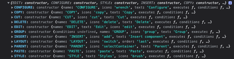
Toolbar Action Customisation
The AEM page editor toolbar provides actions for each editable component (Edit, Configure, Copy, Delete, etc.). You can customise these actions via client-side JavaScript.
Available actions can be inspected in the browser console:
// List all available toolbar actions
Object.keys(Granite.author.EditorFrame.editableToolbar.config.actions);
Disable the Edit Dialog button for a specific component
Hide the "Configure" (wrench) button for a specific component type:
(function($document, author) {
    'use strict';

    $document.on('cq-layer-activated', function(ev) {
        if (ev.layer === 'Edit') {
            var originalCondition = author.EditorFrame.editableToolbar.config.actions.CONFIGURE.condition;

            author.EditorFrame.editableToolbar.config.actions.CONFIGURE.condition = function(editable) {
                // Hide the configure button for this specific component
                if (editable &&
                    editable.config &&
                    editable.config.dialog &&
                    editable.config.dialog === '/apps/myproject/components/abstractcomponent/cq:dialog') {
                    return false;
                }
                // Fall back to the original condition for all other components
                return originalCondition.call(this, editable);
            };
        }
    });

})($(document), Granite.author);
Disable the "Convert to Building Block" button
(function($document, author) {
    'use strict';

    $document.on('cq-layer-activated', function(ev) {
        if (ev.layer === 'Edit') {
            author.EditorFrame.editableToolbar.config.actions.BBCONVERT.condition = function() {
                return false;
            };
        }
    });

})($(document), Granite.author);
Add a custom toolbar action
(function($document, author) {
    'use strict';

    $document.on('cq-layer-activated', function(ev) {
        if (ev.layer === 'Edit') {
            // Add a custom "Analytics" action to the toolbar
            author.EditorFrame.editableToolbar.config.actions.ANALYTICS = {
                icon: 'graphBarVertical',
                text: 'View Analytics',
                handler: function(editable) {
                    var path = editable.path;
                    window.open('/mnt/overlay/dam/gui/content/assets/analysisreport.html?path=' + path, '_blank');
                },
                condition: function(editable) {
                    // Only show for page components
                    return editable.type === 'wcm/foundation/components/responsivegrid';
                }
            };
        }
    });

})($(document), Granite.author);
Clientlib for toolbar customisations
All toolbar JavaScript should be loaded via a clientlib with category cq.authoring.dialog.all or
cq.authoring.editor:
<?xml version="1.0" encoding="UTF-8"?>
<jcr:root xmlns:cq="http://www.day.com/jcr/cq/1.0"
          xmlns:jcr="http://www.jcp.org/jcr/1.0"
    jcr:primaryType="cq:ClientLibraryFolder"
    categories="[cq.authoring.dialog.all]"
    allowProxy="{Boolean}true"/>
#base=js
disableComponentEditing.js
hideBuildingBlocks.js
customToolbarAction.js
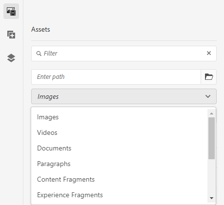
Audio Asset Finder Controller
By default, the AEM Assets side panel doesn't include an audio file filter. You can add one by registering a custom asset controller via a clientlib (preferred) rather than overlaying the product JS files.
Creating the audio controller
The product controllers live at /libs/cq/gui/components/authoring/editors/clientlibs/core/js/assetController.
Copy the pattern from videoController.js and change the name and mimeType:
(function($, ns, channel, window, undefined) {
    'use strict';

    var self = {},
        name = 'Audio';

    self.searchRoot = '/content/dam';
    self.viewInAdminRoot = '/assetdetails.html{+item}';

    var searchPath = self.searchRoot,
        imageServlet = '/bin/wcm/contentfinder/asset/view.html',
        itemResourceType = 'cq/gui/components/authoring/assetfinder/asset';

    self.setUp = function() {};
    self.tearDown = function() {};

    self.loadAssets = function(query, lowerLimit, upperLimit) {
        var param = {
            '_dc': new Date().getTime(),
            'query': query.concat('order:"-jcr:content/jcr:lastModified" '),
            'mimeType': 'audio',
            'itemResourceType': itemResourceType,
            'limit': lowerLimit + '..' + upperLimit,
            '_charset_': 'utf-8'
        };

        return $.ajax({
            type: 'GET',
            dataType: 'html',
            url: Granite.HTTP.externalize(imageServlet) + searchPath,
            data: param
        });
    };

    self.setServlet = function(servlet) { imageServlet = servlet; };
    self.setSearchPath = function(path) { searchPath = path; };
    self.setItemResourceType = function(rt) { itemResourceType = rt; };
    self.resetSearchPath = function() { searchPath = self.searchRoot; };

    // Register as an asset finder tab
    ns.ui.assetFinder.register(name, self);

}(jQuery, Granite.author, jQuery(document), this));
Clientlib setup
<?xml version="1.0" encoding="UTF-8"?>
<jcr:root xmlns:cq="http://www.day.com/jcr/cq/1.0"
          xmlns:jcr="http://www.jcp.org/jcr/1.0"
    jcr:primaryType="cq:ClientLibraryFolder"
    categories="[cq.authoring.dialog.all]"
    allowProxy="{Boolean}true"/>
#base=js
audioController.js
After deployment, a new "Audio" option appears in the asset finder dropdown.
Enabling drag and drop for audio assets
Configure _cq_editConfig.xml to accept audio MIME types on your component:
<?xml version="1.0" encoding="UTF-8"?>
<jcr:root xmlns:sling="http://sling.apache.org/jcr/sling/1.0"
          xmlns:cq="http://www.day.com/jcr/cq/1.0"
          xmlns:jcr="http://www.jcp.org/jcr/1.0"
          xmlns:nt="http://www.jcp.org/jcr/nt/1.0"
    jcr:primaryType="cq:EditConfig">
    <cq:dropTargets jcr:primaryType="nt:unstructured">
        <file
            jcr:primaryType="cq:DropTargetConfig"
            accept="[application/pdf,audio/.*,video/.*,application/zip]"
            groups="[media]"
            propertyName="./fileReference">
            <parameters
                jcr:primaryType="nt:unstructured"
                sling:resourceType="myproject/components/mycomponent"/>
        </file>
    </cq:dropTargets>
    <cq:listeners
        jcr:primaryType="cq:EditListenersConfig"
        afteredit="REFRESH_PAGE"/>
</jcr:root>
The accept property uses regex patterns for MIME types. audio/.* matches all audio formats
(MP3, WAV, OGG, etc.).
Overlay vs sling:resourceSuperType
There are two ways to customise AEM UI elements. Understanding the difference is important:
| Approach | Mechanism | Use when |
|---|---|---|
Overlay (/apps mirrors /libs) | Sling Resource Merger | Modifying product UI elements (navigation, consoles, product dialogs) |
sling:resourceSuperType | Component inheritance | Creating custom components that extend existing ones |
When to overlay
- Hiding navigation items, console columns, or toolbar buttons
- Changing labels, default values, or field properties in product dialogs
- Adding custom tabs to page properties
- Modifying admin console behaviour
When to use inheritance
- Creating custom components that extend Core Components or Foundation Components
- Building container components that extend the responsive grid
- Adding fields to a component dialog while keeping the parent dialog intact
Best Practices
Keep overlays minimal
Only overlay the specific nodes and properties you need to change. The Sling Resource Merger handles the rest. The less you overlay, the fewer conflicts you'll have on AEM upgrades.
<!-- ✅ Good: only change one property -->
<alt jcr:primaryType="nt:unstructured"
     fieldLabel="Accessibility Text (required)"
     required="{Boolean}true"/>

<!-- ❌ Bad: copy the entire dialog and change one field -->
<!-- (Don't do this -- it breaks on AEM upgrades) -->
Never overlay clientlibs
Overlaying /libs clientlibs (js.txt, css.txt, or JS/CSS files) is fragile and breaks on AEM
upgrades. Instead, create your own clientlib with the appropriate category and add your custom
code there.
Use mode="merge" in filter.xml
Always use merge mode for overlay paths:
<filter root="/apps/cq/core/content/nav" mode="merge"/>
Using the default replace mode would delete product nodes not in your overlay.
Document your overlays
Overlays are "invisible" -- they only take effect at runtime. Document what each overlay does and why, so future developers know what was customised.
Test after AEM upgrades
Adobe regularly updates /libs content. After every AEM upgrade or service pack, verify that your
overlays still produce the expected result. Overlays that conflict with new product nodes can cause
subtle UI bugs.
Use sling:orderBefore for positioning
When adding new items (navigation buttons, dialog tabs), use sling:orderBefore to control
placement rather than relying on JCR node ordering:
<myCustomTab jcr:primaryType="nt:unstructured"
             jcr:title="My Tab"
             sling:orderBefore="cloudservices"/>
Common Pitfalls
| Pitfall | Solution |
|---|---|
| Overlay has no effect | Verify the path matches /libs exactly (case-sensitive); check filter.xml includes the overlay path |
| Navigation item still visible after hiding | Clear browser cache and the AEM clientlib cache (/libs/granite/ui/content/dumplibs.rebuild.html) |
| Overlay breaks after AEM upgrade | Minimise overlays; only overlay what you need; test after every upgrade |
filter.xml with mode="replace" deletes product content | Always use mode="merge" for overlay paths |
| Dialog overlay doesn't merge correctly | Ensure you replicate the full node path from root to the target field (every parent node must exist) |
| Custom navigation button doesn't appear | Check the order value; set it between existing items' order values |
| Toolbar action JS doesn't load | Verify clientlib category is cq.authoring.dialog.all or cq.authoring.editor |
| Overlay only works in CRXDE, not after deploy | Add the overlay path to filter.xml and ensure it's included in the content package |
External Resources
See also
- Touch UI (Author UI) -- Touch UI architecture
- Coral UI -- client-side component library
- Render Conditions -- conditionally show/hide UI elements
- Custom Dialog Widgets -- dynamic pathfields, asset finder roots, datasources
- Component Dialogs -- dialog field types
- Custom Component Guide -- component inheritance
- Client Libraries -- loading custom JS/CSS
- Extending the Responsive Grid -- container components via inheritance