Touch UI Component Dialog Examples
The following chapters each present a Coral XML snippet which can be copied into any /components/mycomponent/_cq_dialog/.content.xml file.
TL;DR
- Start from the empty dialog template and evolve it.
- Use
fieldLabel+fieldDescriptionconsistently for author guidance. - Prefer
compositemultifields and@ChildResourcewhen you need structured data. - Keep validation minimal and handle missing values in your Sling Model.
Quick navigation
- AEM Component Help Pages
- Best Practices
- Empty Dialog / Starting Point
- Simple Data Fields
- Complex Data Fields
- Validation (see also the deep dive: Dialog Validation)
- Dialog Inheritance
- cq editConfig - inline editing, listeners, drop targets
- Design Dialog (Template Policies)
- Layout & Read Only
- MSM / Live Copy considerations
- Full XML Example
AEM Component Help Pages
- Open the CRXDE Lite http://localhost:4502/crx/de/index.jsp console.
- Go to the component path. Example:
/apps/<projectname>/components/some/text. - Now create a new markdown file inside the component called README.md.
- Add any documentation content you need.
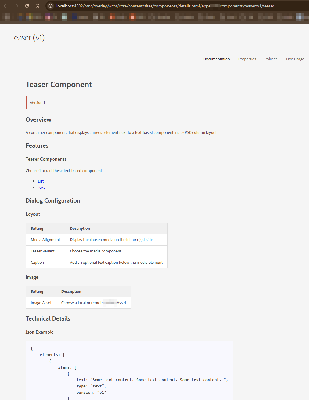
- Now go to http://localhost:4502/libs/wcm/core/content/sites/components.html and select Title Component from the list with a valid Component Group.
- Now copy the URL from the address bar. In my case the URL is
/mnt/overlay/wcm/core/content/sites/components/details.html/apps/<projectname>/components/some/text. - Go to the component within CRXDE Lite > cq:dialog and set the helpPath property to the value of the path copied above.
helpPath="/mnt/overlay/wcm/core/content/sites/components/details.html/apps/<projectname>/components/some/text"
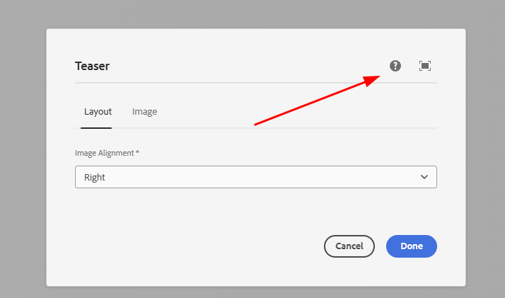
- Now enable and add the component to the page, open the dialog and click on the Help (?) icon.
Set Documentation as Default Active Tab
In order to show documentation as the default active tab when the author clicks on the Help (?) icon, We need to overlay an AEM’s node. Just follow these steps.
- Go to the CRXDE Lite console http://localhost:4502/crx/de/index.jsp
- Go to
/libs/wcm/core/content/sites/components/details/jcr:content/content/single/content/items/content/items/tabs/items/documentation. - Right click on the documentation node and select the Overlay Node option.
- Path:
/libs/wcm/core/content/sites/components/details/jcr:content/content/single/content/items/content/items/tabs/items/documentation - Overlay Location:
/apps/ - Match node types:
checked
- Now go to the overlay path inside the /apps folder
/apps/wcm/core/content/sites/components/details/jcr:content/content/single/content/items/content/items/tabs/items/documentation. Click on the documentation node and set the following propertysling:orderBefore (String) : fixedColumnContainer
ui.apps/src/main/content/jcr_root/apps/wcm/core/content/sites/components/details/.content.xml
<?xml version="1.0" encoding="UTF-8"?>
<jcr:root xmlns:jcr="http://www.jcp.org/jcr/1.0" xmlns:nt="http://www.jcp.org/jcr/nt/1.0"
          xmlns:cq="http://www.day.com/jcr/cq/1.0"
          xmlns:sling="http://sling.apache.org/jcr/sling/1.0"
          jcr:primaryType="cq:Page">
    <jcr:content
        jcr:primaryType="nt:unstructured">
        <content
            jcr:primaryType="nt:unstructured">
            <single jcr:primaryType="nt:unstructured">
                <content
                    jcr:primaryType="nt:unstructured">
                    <items jcr:primaryType="nt:unstructured">
                        <content
                            jcr:primaryType="nt:unstructured">
                            <items jcr:primaryType="nt:unstructured">
                                <tabs
                                    jcr:primaryType="nt:unstructured">
                                    <items jcr:primaryType="nt:unstructured">
                                        <documentation
                                            jcr:primaryType="nt:unstructured"
                                            sling:orderBefore="fixedColumnContainer"/>
                                    </items>
                                </tabs>
                            </items>
                        </content>
                    </items>
                </content>
            </single>
        </content>
    </jcr:content>
</jcr:root>
Best Practices
- If possible, extend an existing core component.
- Version your components
<component>/<version>/<component>. - Structure your fields into tabs where it makes sense
- Do not overuse multifields
- Use as few fields as possible, but as many as necessary
- Use Granite Alerts for important hints or notes
- Use granite wells where fields could be visually grouped.
- Add a component README.md file to help authors
- Add clientLib files directly into the component folder if necessary
- Don't overdo validation, handle missing fields gracefully in the model as well
Common pitfalls
- Missing
nameor missing./prefix, which leads to values not being persisted. - Forgetting
fieldLabel, which makes dialogs harder to scan. - Overusing multifields instead of grouping into separate components.
- Applying clientlibs globally instead of using dialog-specific categories.
Empty Dialog / Starting Point
This is an empty dialog structure and components can be placed in tabs (you can add n tabs.)

<?xml version="1.0" encoding="UTF-8"?>
<jcr:root xmlns:sling="http://sling.apache.org/jcr/sling/1.0" xmlns:granite="http://www.adobe.com/jcr/granite/1.0" xmlns:cq="http://www.day.com/jcr/cq/1.0" xmlns:jcr="http://www.jcp.org/jcr/1.0" xmlns:nt="http://www.jcp.org/jcr/nt/1.0"
          jcr:primaryType="nt:unstructured"
          jcr:title="MyTestComponent"
          sling:resourceType="cq/gui/components/authoring/dialog"
          helpPath="https://url-to-your-documentation.com">
    <content
            granite:class="cmp-mytestcmp__editor"
            jcr:primaryType="nt:unstructured"
            sling:resourceType="granite/ui/components/coral/foundation/container">
        <items jcr:primaryType="nt:unstructured">
            <tabs
                    jcr:primaryType="nt:unstructured"
                    sling:resourceType="granite/ui/components/coral/foundation/tabs"
                    maximized="{Boolean}true">
                <items jcr:primaryType="nt:unstructured">
                    <properties
                            jcr:primaryType="nt:unstructured"
                            jcr:title="Properties"
                            sling:resourceType="granite/ui/components/coral/foundation/container"
                            margin="{Boolean}true">
                        <items jcr:primaryType="nt:unstructured">
                            <columns
                                    jcr:primaryType="nt:unstructured"
                                    sling:resourceType="granite/ui/components/coral/foundation/fixedcolumns"
                                    margin="{Boolean}true">
                                <items jcr:primaryType="nt:unstructured">
                                    <column
                                            jcr:primaryType="nt:unstructured"
                                            sling:resourceType="granite/ui/components/coral/foundation/container">
                                        <items jcr:primaryType="nt:unstructured">
                                        <!--  Place your components / dialog fields here  -->
                                        </items>
                                    </column>
                                </items>
                            </columns>
                        </items>
                    </properties>
                    <layout
                            jcr:primaryType="nt:unstructured"
                            jcr:title="Layout"
                            sling:resourceType="granite/ui/components/coral/foundation/container"
                            margin="{Boolean}true">
                        <items jcr:primaryType="nt:unstructured">
                            <columns
                                    jcr:primaryType="nt:unstructured"
                                    sling:resourceType="granite/ui/components/coral/foundation/fixedcolumns"
                                    margin="{Boolean}true">
                                <items jcr:primaryType="nt:unstructured">
                                    <column
                                            jcr:primaryType="nt:unstructured"
                                            sling:resourceType="granite/ui/components/coral/foundation/container">
                                        <items jcr:primaryType="nt:unstructured">
                                        <!--  Place your components / dialog fields here  -->
                                        </items>
                                    </column>
                                </items>
                            </columns>
                        </items>
                    </layout>
                </items>
            </tabs>
        </items>
    </content>
</jcr:root>
See also
- Custom Component Guide
- Dialog validation
- Components
- Core Components
- HTL Templates
- Touch UI
- Coral UI
- Overlays
- Sling Models - reading policy values
- Custom dialog widgets (dynamic rootpath, asset finder)
- Templates and Policies - design dialogs, component policies
- Tags and Taxonomies - tag field deep dive
- Granite UI Server-side API
- Coral UI Icon List
- Creating a New Granite UI Field Component (Experience League)
- Adding Fields to an AEM Dialog - WKND tutorial
- Configuring the Rich Text Editor (Experience League)

You can write a class or id to your dialog fragment by adding granite:class="some-css-class" or granite:id="some-id". Add required="{Boolean}true" to any component field to mark it as required.
Note, that the actual xml item element tag name, can be anything, as long as its unique for this component.
For example, the Alert field xml does not need to be named alert.
Simple Data Fields
Textfield
<textfield
   jcr:primaryType="nt:unstructured"
   sling:resourceType="granite/ui/components/coral/foundation/form/textfield"
   fieldDescription="The button label"
   fieldLabel="Button Label"
   name="./label"/>

Textarea
<textarea
   jcr:primaryType="nt:unstructured"
   sling:resourceType="granite/ui/components/coral/foundation/form/textarea"
   fieldLabel="This is a text area"
   emptyText="Please add your descriptive text"
   name="./textareacontent"/>

Hidden
<hidden
    jcr:primaryType="nt:unstructured"
    sling:resourceType="granite/ui/components/coral/foundation/form/hidden"
    name="./source"
    value="author-ui"/>
Numberfield
You can define the min, max value and the increments, in which the input can be set.
<numberfield
    jcr:primaryType="nt:unstructured"
    sling:resourceType="granite/ui/components/coral/foundation/form/numberfield"
    fieldLabel="Choose a number value"
    name="./numbervalue"
    min="{Long}1"
    max="{Long}10"
    step="{Double}1"/>

Pathfield (Pathbrowser)
<pathfield
   jcr:primaryType="nt:unstructured"
   sling:resourceType="granite/ui/components/coral/foundation/form/pathfield"
   fieldLabel="Select path"
   rootPath="/content"
   name="./path"/>

Pathfield picker options
<pathfield
   jcr:primaryType="nt:unstructured"
   sling:resourceType="granite/ui/components/coral/foundation/form/pathfield"
   fieldLabel="Select asset"
   forceSelection="{Boolean}true"
   rootPath="/content/dam"
   pickerSrc="/mnt/overlay/granite/ui/content/coral/foundation/form/pathfield/picker.html"
   name="./assetPath"/>
For an implementation of a dynamic rootPath, see Custom Dialog Widgets - Dynamic PathField.
Pathbrowser
In some cases you might want to use the older coral2 pathbrowser component https://experienceleaguecommunities.adobe.com/t5/adobe-experience-manager/when-to-choice-pathbrowser-as-well-as-pathfield/m-p/312540/highlight/true#M32451.
You can recognize the Coral 3 components by the path /components/coral/foundation. The older Coral 2 variants live
in /components/foundation.
<pathbrowser
   jcr:primaryType="nt:unstructured"
   sling:resourceType="granite/ui/components/foundation/form/pathbrowser"
   fieldLabel="Select asset"
   rootpath="/content/dam"
   name="./assetpath"/>

Asset Upload
<file
    jcr:primaryType="nt:unstructured"
    sling:resourceType="cq/gui/components/authoring/dialog/fileupload"
    class="cq-droptarget"
    fileNameParameter="./fileName"
    fileReferenceParameter="./fileReference"
    mimeTypes="[image/gif,image/jpeg,image/png,image/tiff,image/svg+xml]"
    name="./file"/>

Checkbox
<checkbox
    jcr:primaryType="nt:unstructured"
    sling:resourceType="granite/ui/components/coral/foundation/form/checkbox"
    checked="true"
    name="./altValueFromPageImage"
    text="Inherit alternative text from page"
    uncheckedValue="false"
    value="{Boolean}true"/>

Checkbox group
<checkboxGroup
    jcr:primaryType="nt:unstructured"
    sling:resourceType="granite/ui/components/coral/foundation/form/checkboxgroup"
    fieldLabel="Options"
    name="./options">
    <items jcr:primaryType="nt:unstructured">
        <optA text="Option A" value="a" jcr:primaryType="nt:unstructured"/>
        <optB text="Option B" value="b" jcr:primaryType="nt:unstructured"/>
    </items>
</checkboxGroup>
Switch
<switch
   jcr:primaryType="nt:unstructured"
   sling:resourceType="granite/ui/components/coral/foundation/form/switch"
   checked="true"
   name="./switchValue"
   fieldLabel="Toggle Me"
   uncheckedValue="false"
   value="{Boolean}true"/>

Switch with labels
<switch
   jcr:primaryType="nt:unstructured"
   sling:resourceType="granite/ui/components/coral/foundation/form/switch"
   fieldLabel="Enable feature"
   onText="On"
   offText="Off"
   name="./featureEnabled"
   uncheckedValue="false"
   value="{Boolean}true"/>
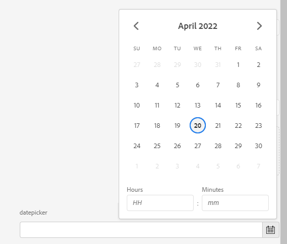
Datepicker
<datepicker
   jcr:primaryType="nt:unstructured"
   sling:resourceType="granite/ui/components/coral/foundation/form/datepicker"
   displayedFormat="MM-DD-YYYY HH:mm"
   fieldLabel="datepicker"
   name="./datepicker"
   type="datetime"
   typeHint="Date"/>
Datepicker constraints
<datepicker
   jcr:primaryType="nt:unstructured"
   sling:resourceType="granite/ui/components/coral/foundation/form/datepicker"
   fieldLabel="Publish date"
   minDate="2024-01-01"
   maxDate="2030-12-31"
   displayedFormat="YYYY-MM-DD"
   name="./publishDate"/>
Colorfield
<colorpicker
    jcr:primaryType="nt:unstructured"
    sling:resourceType="granite/ui/components/coral/foundation/form/colorfield"
    fieldLabel="Brand Color"
    name="./brandColor"
    showDefaultColors="{Boolean}true"
    showProperties="{Boolean}true"
    showSwatches="{Boolean}true"/>
You can also restrict to a predefined palette by providing custom swatches:
<colorpicker
    jcr:primaryType="nt:unstructured"
    sling:resourceType="granite/ui/components/coral/foundation/form/colorfield"
    fieldLabel="Theme Color"
    name="./themeColor"
    showProperties="{Boolean}false"
    showSwatches="{Boolean}true"
    showDefaultColors="{Boolean}false">
    <items jcr:primaryType="nt:unstructured">
        <primary jcr:primaryType="nt:unstructured" value="#0055FF"/>
        <secondary jcr:primaryType="nt:unstructured" value="#FF6600"/>
        <dark jcr:primaryType="nt:unstructured" value="#333333"/>
    </items>
</colorpicker>
Password
<password
    jcr:primaryType="nt:unstructured"
    sling:resourceType="granite/ui/components/coral/foundation/form/password"
    fieldLabel="API Key"
    fieldDescription="Stored as plain text in the JCR - consider using OSGi configs for secrets"
    name="./apiKey"/>
Dialog passwords are stored as plain text in the JCR. For actual secrets, use OSGi secret configurations or context-aware configurations instead.
Button Group
A visual toggle group, useful for alignment or variant selection. Set selectionMode to single, multiple, or none.
<alignment
    jcr:primaryType="nt:unstructured"
    sling:resourceType="granite/ui/components/coral/foundation/form/buttongroup"
    fieldLabel="Text Alignment"
    selectionMode="single"
    name="./alignment">
    <items jcr:primaryType="nt:unstructured">
        <left  jcr:primaryType="nt:unstructured" text="Left"   value="left"   icon="textLeft"/>
        <center jcr:primaryType="nt:unstructured" text="Center" value="center" icon="textCenter" checked="{Boolean}true"/>
        <right jcr:primaryType="nt:unstructured" text="Right"  value="right"  icon="textRight"/>
    </items>
</alignment>
Userpicker
<userpicker
    jcr:primaryType="nt:unstructured"
    sling:resourceType="granite/ui/components/coral/foundation/form/userpicker"
    fieldLabel="User Picker"
    hideServiceUsers="{Boolean}true"
    impersonatesOnly="{Boolean}false"
    name="./user"/>

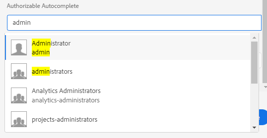
Authorizable Autocomplete
<authautocomplete
    jcr:primaryType="nt:unstructured"
    sling:resourceType="granite/ui/components/coral/foundation/authorizable/autocomplete"
    fieldLabel="User Picker"
    name="./user"/>
Complex Data Fields
Conditional fields (show/hide)
Use a render condition when you need server-side control (for example, permissions or site-level logic).
A render condition decides whether a field is even rendered into the dialog HTML - the author
cannot reveal it from the client. See the dedicated Render Conditions
page for the full pattern (custom rendercondition resource type + server-side logic), and Adobe's
Granite UI render condition reference.
<advancedSettings
    jcr:primaryType="nt:unstructured"
    sling:resourceType="granite/ui/components/coral/foundation/container">
    <granite:rendercondition
        jcr:primaryType="nt:unstructured"
        sling:resourceType="com.myproject/renderconditions/isAdmin"/>
    <items jcr:primaryType="nt:unstructured">
        <!-- advanced fields -->
    </items>
</advancedSettings>
For client-side toggles (show/hide based on a checkbox or select), prefer dialog JS in a small clientlib scoped to dialog usage.
Native showhide with cq-dialog-dropdown-showhide
Before writing custom JS, use the script that ships with AEM. Register the clientlib category
cq.authoring.dialog and a select / checkbox with a specific class can toggle any element that
carries a matching target class and showhidetargetvalue.
Dropdown-controlled target
<linkType
    jcr:primaryType="nt:unstructured"
    sling:resourceType="granite/ui/components/coral/foundation/form/select"
    fieldLabel="Link Type"
    name="./linkType"
    granite:class="cq-dialog-dropdown-showhide">
    <granite:data
        jcr:primaryType="nt:unstructured"
        cq-dialog-dropdown-showhide-target=".cmp-link-type-target"/>
    <items jcr:primaryType="nt:unstructured">
        <internal jcr:primaryType="nt:unstructured" text="Internal" value="internal"/>
        <external jcr:primaryType="nt:unstructured" text="External" value="external"/>
        <email    jcr:primaryType="nt:unstructured" text="Email"    value="email"/>
    </items>
</linkType>

<internalPath
    jcr:primaryType="nt:unstructured"
    sling:resourceType="granite/ui/components/coral/foundation/form/pathfield"
    fieldLabel="Internal Path"
    name="./internalPath"
    rootPath="/content"
    granite:class="cmp-link-type-target hide">
    <granite:data
        jcr:primaryType="nt:unstructured"
        showhidetargetvalue="internal"/>
</internalPath>

<externalUrl
    jcr:primaryType="nt:unstructured"
    sling:resourceType="granite/ui/components/coral/foundation/form/textfield"
    fieldLabel="External URL"
    name="./externalUrl"
    granite:class="cmp-link-type-target hide">
    <granite:data
        jcr:primaryType="nt:unstructured"
        showhidetargetvalue="external"/>
</externalUrl>

<emailAddress
    jcr:primaryType="nt:unstructured"
    sling:resourceType="granite/ui/components/coral/foundation/form/textfield"
    fieldLabel="Email Address"
    name="./emailAddress"
    granite:class="cmp-link-type-target hide">
    <granite:data
        jcr:primaryType="nt:unstructured"
        showhidetargetvalue="email"/>
</emailAddress>
How Adobe's script resolves it:
- The select fires a
changeevent; the script readscq-dialog-dropdown-showhide-target. - It queries the document for every element matching that selector (e.g.
.cmp-link-type-target). - For each target, it reads the target's
showhidetargetvalueand compares to the current select value. - Matching targets get
.hideremoved; all others get it added.
Checkbox-controlled target (same idea, different class)
<enableAnalytics
    jcr:primaryType="nt:unstructured"
    sling:resourceType="granite/ui/components/coral/foundation/form/checkbox"
    text="Enable analytics tracking"
    name="./enableAnalytics"
    value="{Boolean}true"
    uncheckedValue="false"
    granite:class="cq-dialog-checkbox-showhide">
    <granite:data
        jcr:primaryType="nt:unstructured"
        cq-dialog-checkbox-showhide-target=".cmp-analytics-settings"/>
</enableAnalytics>

<trackingId
    jcr:primaryType="nt:unstructured"
    sling:resourceType="granite/ui/components/coral/foundation/form/textfield"
    fieldLabel="Tracking ID"
    name="./trackingId"
    granite:class="cmp-analytics-settings hide"/>
With the checkbox variant, the target is simply shown when checked and hidden when unchecked -
there's no showhidetargetvalue needed.
:::tip Scope the selector inside multifields
Adobe's script queries the whole document by default. Inside a composite multifield every item
has its own controller and target, so a global .cmp-link-type-target selector matches rows other
than the one the author is editing and toggles them all together. For per-row behaviour, use the
custom JS pattern shown below - it scopes lookups to closest("coral-multifield-item").
:::
Dynamic show/hide based on a selection
When one widget controls the visibility of another, you can use dialog JS that reacts to the field value and toggles containers.
1) Add a controller field and a target container
<variant
    jcr:primaryType="nt:unstructured"
    sling:resourceType="granite/ui/components/coral/foundation/form/radiogroup"
    granite:class="some-radiogroup-source"
    fieldLabel="Variant"
    name="./variant">
    <items jcr:primaryType="nt:unstructured">
        <simple jcr:primaryType="nt:unstructured" text="Simple" value="simple"/>
        <advanced jcr:primaryType="nt:unstructured" text="Advanced" value="advanced"/>
    </items>
</variant>

<advancedOptions
    jcr:primaryType="nt:unstructured"
    sling:resourceType="granite/ui/components/coral/foundation/container"
    granite:class="cmp-dialog-advanced"
    margin="{Boolean}true">
    <items jcr:primaryType="nt:unstructured">
        <!-- fields shown only when variant=advanced -->
    </items>
</advancedOptions>
2) Add a dialog-scoped clientlib
<?xml version="1.0" encoding="UTF-8"?>
<jcr:root xmlns:cq="http://www.day.com/jcr/cq/1.0"
          xmlns:jcr="http://www.jcp.org/jcr/1.0"
          jcr:primaryType="cq:ClientLibraryFolder"
          categories="[cq.authoring.dialog]"
          allowProxy="{Boolean}true"/>
Alternatively, load the clientlib specifically only in the components dialog, by adding changing the categories propety to a custom name categories="[cq.authoring.mycomponent]" and
the extraClientlibs="[cq.authoring.mycomponent]" property to its /cq:dialog/.content.xml file.
<?xml version="1.0" encoding="UTF-8"?>
<jcr:root xmlns:jcr="http://www.jcp.org/jcr/1.0" xmlns:nt="http://www.jcp.org/jcr/nt/1.0"
          xmlns:granite="http://www.adobe.com/jcr/granite/1.0"
          xmlns:cq="http://www.day.com/jcr/cq/1.0" xmlns:sling="http://sling.apache.org/jcr/sling/1.0"
          jcr:primaryType="nt:unstructured"
          jcr:title="My Component"
          extraClientlibs="[cq.authoring.mycomponent]"
          sling:resourceType="cq/gui/components/authoring/dialog">
<!-- [...] -->
#base=js
dialog-visibility.js
3) Toggle visibility in JS
Following JQuery Example is for a multifield which has a select dropdown "linkType"
(function (window, document, Granite, $) {
    "use strict"

    /**
     * Initializes the link type source dropdown elements by attaching event handlers for visibility toggling
     * and ensuring a proper initial state for target elements based on dropdown values.
     *
     * This method performs the following actions:
     * - Selects all elements matching the selector `.coral-select.linkType-showhide-source`.
     * - Skips initialization for elements already marked as initialized.
     * - Toggles the visibility of `.linkType-showhide-target` elements based on the selected dropdown value.
     * - Handles dynamic multifield scenarios by adjusting the visibility of DOM elements through CSS.
     *
     * @return {void} This method does not return a value.
     */
    const initializeLinkTypeSources = function () {
        // Find all .class marked input fields
        const linkTypeSources = $('coral-select.linkType-showhide-source');
        if (!linkTypeSources.length) {
            return;
        }

        linkTypeSources.each((index, select) => {
            const $select = $(select);

            // Skip if already initialized
            if ($select.data('linktype-initialized')) {
                return;
            }
            $select.data('linktype-initialized', true);

            /**
             * Controls the visibility of a target element in the DOM based on the selected value
             * in a dropdown menu. Specifically, this function:
             * - Finds the closest `.coral-Well` container relative to the selected dropdown.
             * - Locates the `.linkType-showhide-target` element within the well to determine
             *   the corresponding target element.
             * - Toggles the target element's visibility based on the value of the dropdown menu.
             *
             * @function toggleTarget
             * @description Dynamically toggles the visibility of an element, typically used
             *              in cases such as multifield item handling or conditional UI display.
             */
            const toggleTarget = function () {
                const value = select.value;
                const well = $select.closest('div.coral-Well');
                const target = well.find('.linkType-showhide-target')?.closest('div.coral-Form-fieldwrapper');
                console.log("target", target);
                if (!target.length) {
                    return;
                }

                // We have to show/hide via css, since newly added multifield items would otherwise always show the query textarea
                if (value === 'mail') {
                    target.css('display', 'block');
                } else {
                    target.css('display', 'none');
                }
            };

            // Show/Hide on Dialog-Ready
            toggleTarget();

            // Show/Hide on Select Change Events
            $select.on('change', function (event) {
                toggleTarget();
            });
        });
    };

    $(document).on('dialog-ready', (event) => {
        initializeLinkTypeSources();

        // Watch for multifield item changes (add/remove coral-multifield-item)
        const multifields = document.querySelectorAll('coral-multifield');
        multifields.forEach((multifield) => {
            const observer = new MutationObserver((mutations) => {
                mutations.forEach((mutation) => {
                    if (mutation.type === 'childList') {
                        // Re-initialize when coral-multifield-item is added or removed
                        initializeLinkTypeSources();
                    }
                });
            });

            observer.observe(multifield, {
                childList: true,
                subtree: false
            });
        });
    });
})(window, document, Granite, $);
Select Dropdown
<select
        jcr:primaryType="nt:unstructured"
        sling:resourceType="granite/ui/components/coral/foundation/form/select"
        fieldLabel="List Item"
        name="./selectItem">
    <items jcr:primaryType="nt:unstructured">
        <children
                jcr:primaryType="nt:unstructured"
                text="Child pages"
                value="children"/>
        <static
                jcr:primaryType="nt:unstructured"
                text="Fixed list"
                value="static"/>
        <search
                jcr:primaryType="nt:unstructured"
                text="Search"
                value="search"/>
        <tags
                jcr:primaryType="nt:unstructured"
                text="Tags"
                value="tags"/>
    </items>
</select>
Open

Closed

Select with datasource
<categorySelect
    jcr:primaryType="nt:unstructured"
    sling:resourceType="granite/ui/components/coral/foundation/form/select"
    fieldLabel="Category"
    name="./category">
    <datasource
        jcr:primaryType="nt:unstructured"
        sling:resourceType="/apps/myproject/datasource/categories"/>
    <items jcr:primaryType="nt:unstructured"/>
</categorySelect>
The datasource servlet
The datasource sling:resourceType points at a servlet that builds the option list at dialog-render
time. The servlet sets a DataSource request attribute whose items are resources of type
nt:unstructured carrying value and text properties - exactly what the select expects.
import com.adobe.granite.ui.components.ds.DataSource;
import com.adobe.granite.ui.components.ds.SimpleDataSource;
import com.adobe.granite.ui.components.ds.ValueMapResource;
import org.apache.sling.api.SlingHttpServletRequest;
import org.apache.sling.api.SlingHttpServletResponse;
import org.apache.sling.api.resource.ResourceMetadata;
import org.apache.sling.api.resource.ResourceResolver;
import org.apache.sling.api.resource.ValueMap;
import org.apache.sling.api.wrappers.ValueMapDecorator;
import org.apache.sling.servlets.annotations.SlingServletResourceTypes;
import org.osgi.service.component.annotations.Component;

import javax.servlet.Servlet;
import java.util.ArrayList;
import java.util.Iterator;
import java.util.LinkedHashMap;
import java.util.List;
import java.util.Map;

@Component(service = Servlet.class)
@SlingServletResourceTypes(
    resourceTypes = "myproject/datasource/categories",
    methods = "GET"
)
public class CategoryDatasourceServlet extends org.apache.sling.api.servlets.SlingSafeMethodsServlet {

    @Override
    protected void doGet(SlingHttpServletRequest request, SlingHttpServletResponse response) {
        ResourceResolver resolver = request.getResourceResolver();

        // Source your options however you like: a config, a query, a service, a taxonomy...
        Map<String, String> options = new LinkedHashMap<>();
        options.put("news", "News");
        options.put("blog", "Blog");
        options.put("press", "Press Release");

        List<org.apache.sling.api.resource.Resource> items = new ArrayList<>();
        for (Map.Entry<String, String> entry : options.entrySet()) {
            ValueMap vm = new ValueMapDecorator(new java.util.HashMap<>());
            vm.put("value", entry.getKey());
            vm.put("text", entry.getValue());
            items.add(new ValueMapResource(resolver, new ResourceMetadata(), "nt:unstructured", vm));
        }

        Iterator<org.apache.sling.api.resource.Resource> it = items.iterator();
        DataSource ds = new SimpleDataSource(it);
        request.setAttribute(DataSource.class.getName(), ds);
    }
}
:::tip Preselect the saved value
A datasource select does not automatically mark the currently-stored value as selected the way static
items do. To preselect, read the component's saved value from the request
(request.getRequestPathInfo() / the value request attribute that Granite sets on the field
resource) and set a selected=true property on the matching item. For most cases the simpler path is
to let Coral match on value - confirm against your AEM version.
:::
Radio Select
<radio
        jcr:primaryType="nt:unstructured"
        sling:resourceType="granite/ui/components/coral/foundation/form/radiogroup"
        name="./radioselection"
        vertical="{Boolean}true"
        fieldLabel="Radio Select">
    <items jcr:primaryType="nt:unstructured">
        <vara
                jcr:primaryType="nt:unstructured"
                text="Variation A"
                value="var-a"/>
        <varb
                jcr:primaryType="nt:unstructured"
                text="Variation B"
                value="var-b"/>
    </items>
</radio>

Coral 3 radio group (explicit)
<variant
    jcr:primaryType="nt:unstructured"
    sling:resourceType="granite/ui/components/coral/foundation/form/radiogroup"
    fieldLabel="Variant"
    name="./variant">
    <items jcr:primaryType="nt:unstructured">
        <simple text="Simple" value="simple" jcr:primaryType="nt:unstructured"/>
        <advanced text="Advanced" value="advanced" jcr:primaryType="nt:unstructured"/>
    </items>
</variant>
Datasource-backed fields
For dynamic values, provide a datasource resource type. This works well for autocomplete and selects.
<customValue
    jcr:primaryType="nt:unstructured"
    sling:resourceType="granite/ui/components/coral/foundation/form/autocomplete"
    fieldLabel="Backend-driven values"
    name="./customValue"
    emptyText="Pick a value"
    multiple="{Boolean}false">
    <datasource
        jcr:primaryType="nt:unstructured"
        sling:resourceType="/apps/myproject/datasource/customstrings"/>
    <options
        jcr:primaryType="nt:unstructured"
        sling:resourceType="granite/ui/components/coral/foundation/form/autocomplete/list"/>
</customValue>
Multifield
A multifield wraps a predefined group of components and lets an author create n of these sets. The data will be saved to subnodes.
Access that data via @ChildResource Annotation in your Sling Model, as described here.
Add composite="{Boolean}true" to save the entries as a child node which in return can easily be injected into a Sling Model via @ChildResource.
Otherwise all values entered will be stored on the node itself as Array Properties.
Multifield validation (min/max)
<links
    jcr:primaryType="nt:unstructured"
    sling:resourceType="granite/ui/components/coral/foundation/form/multifield"
    composite="{Boolean}true">
    <granite:data
        jcr:primaryType="nt:unstructured"
        min-items="1"
        max-items="5"/>
    <field
        jcr:primaryType="nt:unstructured"
        sling:resourceType="granite/ui/components/coral/foundation/container"
        name="./links">
        <items jcr:primaryType="nt:unstructured">
            <textvalue
                jcr:primaryType="nt:unstructured"
                sling:resourceType="granite/ui/components/coral/foundation/form/textfield"
                fieldLabel="Link Text"
                name="./text"/>
        </items>
    </field>
</links>
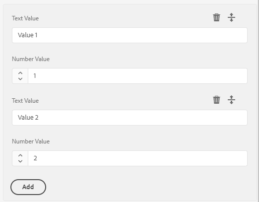
<myMultifield
    jcr:primaryType="nt:unstructured"
    sling:resourceType="granite/ui/components/coral/foundation/form/multifield"
    composite="{Boolean}true"
    required="{Boolean}true">
    <field
        jcr:primaryType="nt:unstructured"
        sling:resourceType="granite/ui/components/coral/foundation/container"
        name="./values">
        <items jcr:primaryType="nt:unstructured">
            <textvalue
                jcr:primaryType="nt:unstructured"
                sling:resourceType="granite/ui/components/coral/foundation/form/textfield"
                fieldLabel="Text Value"
                name="./textvalue"/>
            <numbervalue
                 jcr:primaryType="nt:unstructured"
                 sling:resourceType="granite/ui/components/coral/foundation/form/numberfield"
                 fieldLabel="Number Value"
                 name="./numbervalue"/>
        </items>
    </field>
</myMultifield>
FieldSet (grouped fields)
A fieldset groups related fields under a single legend, and - usefully - prefixes every nested
field's property name so the values land in a subnode of the component. This is the cleanest way
to persist "a logical sub-object" (e.g. social links, SEO metadata) without reaching for a
multifield.
<social
    jcr:primaryType="nt:unstructured"
    sling:resourceType="granite/ui/components/coral/foundation/form/fieldset"
    jcr:title="Social Links"
    name="./social">
    <items jcr:primaryType="nt:unstructured">
        <twitter
            jcr:primaryType="nt:unstructured"
            sling:resourceType="granite/ui/components/coral/foundation/form/textfield"
            fieldLabel="Twitter / X"
            name="./twitter"/>
        <linkedin
            jcr:primaryType="nt:unstructured"
            sling:resourceType="granite/ui/components/coral/foundation/form/textfield"
            fieldLabel="LinkedIn"
            name="./linkedin"/>
    </items>
</social>
The above persists to:
myComponent
  └─ social/
       ├─ twitter = "..."
       └─ linkedin = "..."
Read it in a Sling Model with @ChildResource:
@ChildResource
private Resource social;

public String getTwitter() {
    return social != null ? social.getValueMap().get("twitter", String.class) : null;
}
:::tip Fieldset vs Well vs Multifield
- Well - visual grouping only. No name prefix, no subnode.
- Fieldset - visual grouping and persistence into a subnode (
name="./social"). - Multifield - use only when authors can add n repeating items. A fieldset is almost always the right choice for a fixed group of fields. :::
Accordion
You can add a parentConfig block with active to set the accordion to be opened by default.
Any dialog field can be added to each accordion item items block.
<accordion
        jcr:primaryType="nt:unstructured"
        sling:resourceType="granite/ui/components/coral/foundation/accordion"
        variant="default">
    <items jcr:primaryType="nt:unstructured">
        <block1
                jcr:primaryType="nt:unstructured"
                jcr:title="Some Category"
                sling:resourceType="granite/ui/components/coral/foundation/container"
                maximized="{Boolean}true">
            <items jcr:primaryType="nt:unstructured">
                <textvalue1
                        jcr:primaryType="nt:unstructured"
                        sling:resourceType="granite/ui/components/coral/foundation/form/textfield"
                        fieldLabel="Text Value"
                        name="./textvalue"/>
                <textvalue2
                        jcr:primaryType="nt:unstructured"
                        sling:resourceType="granite/ui/components/coral/foundation/form/textfield"
                        fieldLabel="Text Value 2"
                        name="./textvalue2"/>
            </items>
            <parentConfig
               jcr:primaryType="nt:unstructured"
               active="{Boolean}true"/>
        </block1>
        <block2
                jcr:primaryType="nt:unstructured"
                jcr:title="Another Category"
                sling:resourceType="granite/ui/components/coral/foundation/container"
                maximized="{Boolean}true">
            <items jcr:primaryType="nt:unstructured">
                <numbervalue
                        jcr:primaryType="nt:unstructured"
                        sling:resourceType="granite/ui/components/coral/foundation/form/numberfield"
                        fieldLabel="Number Value"
                        name="./numbervalue"/>
                <numbervalue2
                        jcr:primaryType="nt:unstructured"
                        sling:resourceType="granite/ui/components/coral/foundation/form/numberfield"
                        fieldLabel="Number Value 2"
                        name="./numbervalue2"/>
            </items>
        </block2>
    </items>
</accordion>

Tags field
See also the Tags and Taxonomies deep dive.
<tags
    jcr:primaryType="nt:unstructured"
    sling:resourceType="cq/gui/components/coral/common/form/tagfield"
    fieldLabel="Tags"
    name="./cq:tags"
    multiple="{Boolean}true"
    rootPath="/content/cq:tags/myproject"/>
name="./cq:tags"is the conventional property name - Sling and AEM search already understand it, andcom.day.cq.tagging.TagManagerreads it by default.rootPathrestricts the picker to a specific taxonomy branch, which keeps authors from tagging with marketing tags intended for other projects. Omit it only when the component is truly cross-project.multiple="{Boolean}true"persists aString[]- even for a single tag, this is usually what you want, since it matches the AEM default.
Reading tags in a Sling Model - never concatenate paths, let TagManager resolve them so admin
UI paths are treated correctly:
import com.day.cq.tagging.Tag;
import com.day.cq.tagging.TagManager;

@ValueMapValue(name = "cq:tags")
private String[] tagIds;

@SelfInjected
private SlingHttpServletRequest request;

public List<Tag> getTags() {
    if (tagIds == null || tagIds.length == 0) {
        return Collections.emptyList();
    }
    TagManager tagManager = request.getResourceResolver().adaptTo(TagManager.class);
    return Arrays.stream(tagIds)
            .map(tagManager::resolve)
            .filter(Objects::nonNull)
            .collect(Collectors.toList());
}
See Tags and Taxonomies for the full model, including reading localized tag titles and filtering by namespace.
Link tuple (label + URL + target)
A recurring pattern is a "link" made of three related fields. Group them inside a fieldset so
they persist to a single subnode, and handle the target="_blank" security additions in the
Sling Model - not in the dialog.
<link
    jcr:primaryType="nt:unstructured"
    sling:resourceType="granite/ui/components/coral/foundation/form/fieldset"
    jcr:title="Call-to-action link"
    name="./link">
    <items jcr:primaryType="nt:unstructured">
        <label
            jcr:primaryType="nt:unstructured"
            sling:resourceType="granite/ui/components/coral/foundation/form/textfield"
            fieldLabel="Label"
            name="./label"/>
        <url
            jcr:primaryType="nt:unstructured"
            sling:resourceType="granite/ui/components/coral/foundation/form/pathfield"
            fieldLabel="URL or path"
            fieldDescription="Internal paths or full URLs (https://...)"
            name="./url"/>
        <target
            jcr:primaryType="nt:unstructured"
            sling:resourceType="granite/ui/components/coral/foundation/form/select"
            fieldLabel="Open in"
            name="./target">
            <items jcr:primaryType="nt:unstructured">
                <self  jcr:primaryType="nt:unstructured" text="Same tab"  value="_self" selected="{Boolean}true"/>
                <blank jcr:primaryType="nt:unstructured" text="New tab"   value="_blank"/>
            </items>
        </target>
    </items>
</link>
Sling Model reading the subnode as a structured object - and adding rel for _blank links:
@Model(adaptables = Resource.class)
public class LinkModel {

    @ValueMapValue
    @Default(values = "")
    private String label;

    @ValueMapValue
    @Default(values = "")
    private String url;

    @ValueMapValue
    @Default(values = "_self")
    private String target;

    public String getRel() {
        // Only _blank needs noopener/noreferrer to prevent window.opener hijacking.
        return "_blank".equals(target) ? "noopener noreferrer" : null;
    }

    // label, url, target getters...
}
Adapt in the parent model with @ChildResource:
@ChildResource
private LinkModel link;
Content Fragment picker
Select a Content Fragment by path. Useful for headless or structured-content components.
<contentFragment
    jcr:primaryType="nt:unstructured"
    sling:resourceType="granite/ui/components/coral/foundation/form/pathfield"
    fieldLabel="Content Fragment"
    fieldDescription="Select a Content Fragment"
    rootPath="/content/dam"
    filter="hierarchyNotFile"
    name="./fragmentPath"/>
For a picker that restricts to a specific CF model, use a datasource or render condition in your project.
Experience Fragment picker
<experienceFragment
    jcr:primaryType="nt:unstructured"
    sling:resourceType="granite/ui/components/coral/foundation/form/pathfield"
    fieldLabel="Experience Fragment"
    rootPath="/content/experience-fragments"
    name="./experienceFragmentPath"/>
Validation
Most dialogs only need the declarative attributes; for anything else, see the dedicated Dialog Validation page for custom validators, async / server checks, multifield rules, styling, and debugging.
Quick reference - declarative attributes
<title
    jcr:primaryType="nt:unstructured"
    sling:resourceType="granite/ui/components/coral/foundation/form/textfield"
    fieldLabel="Title"
    name="./title"
    required="{Boolean}true"
    maxlength="{Long}80"/>

<price
    jcr:primaryType="nt:unstructured"
    sling:resourceType="granite/ui/components/coral/foundation/form/numberfield"
    fieldLabel="Price"
    name="./price"
    min="{Double}0.01"
    max="{Double}99999.99"
    step="{Double}0.01"/>

<nodeName
    jcr:primaryType="nt:unstructured"
    sling:resourceType="granite/ui/components/coral/foundation/form/textfield"
    fieldLabel="Node name"
    name="./name"
    validation="foundation.jcr.name"/>
| Attribute | Purpose |
|---|---|
required="{Boolean}true" | Field must not be empty |
maxlength="{Long}80" | Max string length (textfield, textarea) |
min / max / step | Numeric bounds (numberfield) |
validation="foundation.jcr.name" | Pre-registered Granite validator |
For the full list of pre-registered foundation.* validators, custom validator registration, the
Foundation Validation API lifecycle, server-side rules, and multifield patterns, continue to
Dialog Validation.
Dialog Inheritance
Extending a parent dialog with sling:resourceSuperType
When your component extends another (e.g. a core component), its dialog can inherit from the parent. Fields, tabs, and structure are merged automatically.
<?xml version="1.0" encoding="UTF-8"?>
<jcr:root xmlns:sling="http://sling.apache.org/jcr/sling/1.0"
          xmlns:jcr="http://www.jcp.org/jcr/1.0"
          xmlns:nt="http://www.jcp.org/jcr/nt/1.0"
          jcr:primaryType="nt:unstructured"
          jcr:title="My Text"
          sling:resourceType="cq/gui/components/authoring/dialog">
    <content jcr:primaryType="nt:unstructured"
             sling:resourceType="granite/ui/components/coral/foundation/container">
        <items jcr:primaryType="nt:unstructured">
            <tabs jcr:primaryType="nt:unstructured"
                  sling:resourceType="granite/ui/components/coral/foundation/tabs"
                  maximized="{Boolean}true">
                <items jcr:primaryType="nt:unstructured">
                    <!-- New tab added to the inherited dialog -->
                    <analytics
                        jcr:primaryType="nt:unstructured"
                        jcr:title="Analytics"
                        sling:resourceType="granite/ui/components/coral/foundation/container"
                        margin="{Boolean}true">
                        <items jcr:primaryType="nt:unstructured">
                            <trackingId
                                jcr:primaryType="nt:unstructured"
                                sling:resourceType="granite/ui/components/coral/foundation/form/textfield"
                                fieldLabel="Tracking ID"
                                name="./trackingId"/>
                        </items>
                    </analytics>
                </items>
            </tabs>
        </items>
    </content>
</jcr:root>
The component's .content.xml must reference the parent:
<jcr:root xmlns:jcr="http://www.jcp.org/jcr/1.0"
          xmlns:cq="http://www.day.com/jcr/cq/1.0"
          xmlns:sling="http://sling.apache.org/jcr/sling/1.0"
          jcr:primaryType="cq:Component"
          jcr:title="My Text"
          sling:resourceSuperType="core/wcm/components/text/v2/text"
          componentGroup="My Project"/>
Hiding inherited tabs or fields with sling:hideChildren
To remove specific tabs or fields inherited from a parent dialog, use sling:hideChildren:
<!-- Hide specific tabs by name -->
<items jcr:primaryType="nt:unstructured"
       sling:hideChildren="[layoutTab,stylesTab]">
    <!-- your additional tabs here -->
</items>
To hide all inherited children and start fresh:
<items jcr:primaryType="nt:unstructured"
       sling:hideChildren="[*]">
    <!-- only your own tabs will show -->
</items>
You can also hide individual fields within a tab using the same mechanism deeper in the tree.
Hiding a single field with granite:hide
<unwantedField
    jcr:primaryType="nt:unstructured"
    granite:hide="{Boolean}true"/>
cq editConfig - inline editing, listeners, drop targets
_cq_editConfig.xml (file system form) or the cq:editConfig node sits next to _cq_dialog and
controls how the component behaves in edit mode before the dialog opens: which inline editors
are allowed, what gets dropped onto the component, and which client-side events should re-render
the component after a save.
components/mycomponent/
  _cq_dialog/.content.xml         # dialog that opens on "configure"
  _cq_editConfig.xml              # inline editing + drop targets
  mycomponent.html
Drop target for assets
Lets authors drag an image from the asset finder straight onto the component.
<?xml version="1.0" encoding="UTF-8"?>
<jcr:root xmlns:cq="http://www.day.com/jcr/cq/1.0"
          xmlns:jcr="http://www.jcp.org/jcr/1.0"
          xmlns:nt="http://www.jcp.org/jcr/nt/1.0"
          jcr:primaryType="cq:EditConfig">
    <cq:dropTargets jcr:primaryType="nt:unstructured">
        <image
            jcr:primaryType="cq:DropTargetConfig"
            accept="[image/.*]"
            groups="[media]"
            propertyName="./fileReference">
            <parameters
                jcr:primaryType="nt:unstructured"
                sling:resourceType="myproject/components/mycomponent"/>
        </image>
    </cq:dropTargets>
</jcr:root>
The propertyName is where the path of the dragged asset is stored on the component's resource.
Mark the component HTML with cq-droptarget (or the clientlib-generated class) so the drop zone is
visible in edit mode.
Inline editor (edit text without opening the dialog)
<cq:editConfig jcr:primaryType="cq:EditConfig">
    <cq:inplaceEditing
        jcr:primaryType="cq:InplaceEditingConfig"
        active="{Boolean}true"
        configPath="/apps/myproject/components/mycomponent/_cq_editConfig/inplaceEditing"
        editorType="text">
        <config
            jcr:primaryType="nt:unstructured"
            editElementQuery=".cmp-mycomponent__title"
            propertyName="./title"
            textPropertyName="./title"/>
    </cq:inplaceEditing>
</cq:editConfig>
editorType="text"- plain textfield inline editor.editorType="plaintext"- same, but strips HTML on save.editorType="title"- classic title editor (single line, pressing Enter saves).
For Rich Text inline editing, set editorType="text" and add the full rtePlugins config similar
to the dialog RTE widget - see Rich Text Editor (RTE) for the complete
plugin/toolbar structure.
Listeners (refresh behaviour after save)
By default, AEM refreshes only the edited component. If a component's HTML depends on siblings (e.g. a carousel that re-renders when a slide changes), broaden the refresh:
<cq:listeners
    jcr:primaryType="cq:EditListenersConfig"
    afteredit="REFRESH_PAGE"
    afterinsert="REFRESH_PAGE"
    afterdelete="REFRESH_PAGE"
    afterchildinsert="REFRESH_SELF"/>
| Value | Effect |
|---|---|
REFRESH_SELF (default) | Re-render only this component |
REFRESH_PARENT | Re-render the enclosing container |
REFRESH_PAGE | Reload the whole page |
| Custom JS function name | Called with the edit event - use for targeted DOM updates |
:::warning REFRESH_PAGE is a sledgehammer
Every change forces a full page reload, which is slow and loses any unsaved edits in other
components. Reach for REFRESH_SELF or REFRESH_PARENT first; only escalate to REFRESH_PAGE
when siblings genuinely depend on each other.
:::
Disabling default actions
Remove the "Copy" or "Delete" buttons from the component toolbar:
<cq:editConfig
    jcr:primaryType="cq:EditConfig"
    cq:actions="[edit,insert]"/>
Omitting copymove and delete hides those toolbar buttons. The default list is
[edit,copymove,delete,insert].
Design Dialog (Template Policies)
A _cq_design_dialog defines fields that appear in the template editor (Edit Template > Policy).
Values are stored on the template policy, not on the component instance, and apply to all instances of the component
using that template.
components/
  mycomponent/
    _cq_dialog/.content.xml          <-- instance dialog (per component)
    _cq_design_dialog/.content.xml   <-- design dialog (per template policy)
    mycomponent.html
<?xml version="1.0" encoding="UTF-8"?>
<jcr:root xmlns:sling="http://sling.apache.org/jcr/sling/1.0"
          xmlns:jcr="http://www.jcp.org/jcr/1.0"
          xmlns:nt="http://www.jcp.org/jcr/nt/1.0"
          jcr:primaryType="nt:unstructured"
          jcr:title="My Component - Policy"
          sling:resourceType="cq/gui/components/authoring/dialog">
    <content jcr:primaryType="nt:unstructured"
             sling:resourceType="granite/ui/components/coral/foundation/container">
        <items jcr:primaryType="nt:unstructured">
            <tabs jcr:primaryType="nt:unstructured"
                  sling:resourceType="granite/ui/components/coral/foundation/tabs"
                  maximized="{Boolean}true">
                <items jcr:primaryType="nt:unstructured">
                    <properties
                        jcr:primaryType="nt:unstructured"
                        jcr:title="Settings"
                        sling:resourceType="granite/ui/components/coral/foundation/container"
                        margin="{Boolean}true">
                        <items jcr:primaryType="nt:unstructured">
                            <columns jcr:primaryType="nt:unstructured"
                                     sling:resourceType="granite/ui/components/coral/foundation/fixedcolumns"
                                     margin="{Boolean}true">
                                <items jcr:primaryType="nt:unstructured">
                                    <column jcr:primaryType="nt:unstructured"
                                            sling:resourceType="granite/ui/components/coral/foundation/container">
                                        <items jcr:primaryType="nt:unstructured">
                                            <headingLevel
                                                jcr:primaryType="nt:unstructured"
                                                sling:resourceType="granite/ui/components/coral/foundation/form/select"
                                                fieldLabel="Default Heading Level"
                                                name="./headingLevel">
                                                <items jcr:primaryType="nt:unstructured">
                                                    <h2 jcr:primaryType="nt:unstructured" text="H2" value="h2" selected="{Boolean}true"/>
                                                    <h3 jcr:primaryType="nt:unstructured" text="H3" value="h3"/>
                                                    <h4 jcr:primaryType="nt:unstructured" text="H4" value="h4"/>
                                                </items>
                                            </headingLevel>
                                            <maxItems
                                                jcr:primaryType="nt:unstructured"
                                                sling:resourceType="granite/ui/components/coral/foundation/form/numberfield"
                                                fieldLabel="Max visible items"
                                                fieldDescription="Limits the number of items an author can add"
                                                name="./maxItems"
                                                min="{Long}1"
                                                max="{Long}20"
                                                value="{Long}5"/>
                                        </items>
                                    </column>
                                </items>
                            </columns>
                        </items>
                    </properties>
                </items>
            </tabs>
        </items>
    </content>
</jcr:root>
Reading policy values in a Sling Model:
import com.day.cq.wcm.api.policies.ContentPolicy;
import com.day.cq.wcm.api.policies.ContentPolicyManager;

@Model(adaptables = SlingHttpServletRequest.class)
public class MyComponentModel {

    @SlingObject
    private Resource resource;

    public String getDefaultHeadingLevel() {
        ContentPolicyManager policyManager = resource.getResourceResolver()
            .adaptTo(ContentPolicyManager.class);
        if (policyManager != null) {
            ContentPolicy policy = policyManager.getPolicy(resource);
            if (policy != null) {
                return policy.getProperties().get("headingLevel", "h2");
            }
        }
        return "h2";
    }
}
For reusable helper methods to read policy values, see the Sling Models page.
Layout & Read Only
Alert
<alert
   granite:class="cmp-editor-alert"
   jcr:primaryType="nt:unstructured"
   sling:resourceType="granite/ui/components/coral/foundation/alert"
   size="S"
   jcr:title="Some-Title"
   text="Alert text"
   variant="warning"/>
- Variant options are:
error,warning,success,helpandinfowithinfobeing the default. - Size options are:
SandLwithSbeing the default.

You could now leverage the css class cmp-editor-alert to set the alert box div to e.g width: 100%.
Hyperlink
<hyperlink
   jcr:primaryType="nt:unstructured"
   sling:resourceType="granite/ui/components/coral/foundation/hyperlink"
   target="_blank"
   rel="noopener noreferrer"
   text="Granite Hyperlink Documentation"
   icon="link"
   href="https://developer.adobe.com/experience-manager/reference-materials/6-5/granite-ui/api/jcr_root/libs/granite/ui/components/coral/foundation/hyperlink/index.html"/>

Check the Coral UI Icon List for available icons.
When adding these kinds of read only components, you will most likely need to add custom css via granite:class="someclass" to fix/update the layout.
For example, set display:block, to move the next item to a new line.
Text
You can add simple, readonly text to the dialog. This lets you add "notes" or declarative text.
<text
   jcr:primaryType="nt:unstructured"
   sling:resourceType="granite/ui/components/coral/foundation/text"
   text="Some help text :)"/>

Heading
<heading
    jcr:primaryType="nt:unstructured"
    sling:resourceType="granite/ui/components/coral/foundation/heading"
    level="{Long}2"
    text="Some Heading"/>

Well
A Well groups items together visually, by adding a background color and a small margin.
<wellGroup jcr:primaryType="nt:unstructured"
               sling:resourceType="granite/ui/components/coral/foundation/well">
    <items jcr:primaryType="nt:unstructured">
        <textvalue1
                jcr:primaryType="nt:unstructured"
                sling:resourceType="granite/ui/components/coral/foundation/form/textfield"
                fieldLabel="Text Value"
                name="./textvalue"/>
        <somenumber
                jcr:primaryType="nt:unstructured"
                sling:resourceType="granite/ui/components/coral/foundation/form/numberfield"
                fieldLabel="Number Value"
                name="./numbervalue2"/>
    </items>
</wellGroup>

Granite data attributes for JS hooks
Use granite:data to expose custom attributes for dialog scripts.
<textvalue
    jcr:primaryType="nt:unstructured"
    sling:resourceType="granite/ui/components/coral/foundation/form/textfield"
    fieldLabel="Label"
    name="./label">
    <granite:data
        jcr:primaryType="nt:unstructured"
        role="dialog-toggle"
        target=".cmp-dialog-advanced"/>
</textvalue>
Collapsible container
<section
    jcr:primaryType="nt:unstructured"
    sling:resourceType="granite/ui/components/coral/foundation/accordion"
    variant="default">
    <items jcr:primaryType="nt:unstructured">
        <group
            jcr:primaryType="nt:unstructured"
            jcr:title="Advanced"
            sling:resourceType="granite/ui/components/coral/foundation/container"
            maximized="{Boolean}false">
            <items jcr:primaryType="nt:unstructured">
                <!-- fields -->
            </items>
        </group>
    </items>
</section>
Persisted values and defaults
- Use
./propertyNameto persist values on the component node. - When changing field names, add migration logic or fallback in your model.
- Prefer handling defaults in Sling Models rather than relying solely on dialog defaults.
@ValueMapValue
private String variant;

public String getVariant() {
    return StringUtils.defaultIfBlank(variant, "simple");
}
Field naming conventions
- Always include the
./prefix to store values on the current component node. - Use consistent prefixes for related fields (for example,
ctaText,ctaLink). - Avoid renaming existing fields unless you migrate content.
Rich Text Editor (RTE)
The Rich Text Editor (cq/gui/components/authoring/dialog/richtext) is the most configurable field in
the dialog framework. It is driven by plugins (each plugin contributes toolbar buttons and
behaviours) and a toolbar definition that decides which of those buttons are shown. The official
references are Adobe's
Configuring the Rich Text Editor
guide and the
Configure the RTE plug-ins (Experience League).
Minimal inline RTE
<text
    jcr:primaryType="nt:unstructured"
    sling:resourceType="cq/gui/components/authoring/dialog/richtext"
    name="./text"
    useFixedInlineToolbar="{Boolean}true">
    <uiSettings jcr:primaryType="nt:unstructured">
        <cui jcr:primaryType="nt:unstructured">
            <inline
                jcr:primaryType="nt:unstructured"
                toolbar="[format#bold,format#italic,links#modifylink,links#unlink,#paraformat]"/>
        </cui>
    </uiSettings>
</text>
Full RTE configuration
A complete RTE wires up rtePlugins (what is enabled and how it behaves) and uiSettings (which
buttons appear, and in what order, for the inline, dialogFullScreen, and tableEditOptions toolbars).
This example enables formatting, lists, links, paragraph formats, a Styles dropdown backed by
component CSS, paste-as-plaintext, special characters, find/replace, and source editing.
<text
    jcr:primaryType="nt:unstructured"
    sling:resourceType="cq/gui/components/authoring/dialog/richtext"
    fieldLabel="Body"
    name="./text"
    useFixedInlineToolbar="{Boolean}true">
    <rtePlugins jcr:primaryType="nt:unstructured">
        <format
            jcr:primaryType="nt:unstructured"
            features="[bold,italic,underline]"/>
        <subsuperscript
            jcr:primaryType="nt:unstructured"
            features="[subscript,superscript]"/>
        <lists
            jcr:primaryType="nt:unstructured"
            features="[ordered,unordered,indent,outdent]"/>
        <justify
            jcr:primaryType="nt:unstructured"
            features="*"/>
        <links
            jcr:primaryType="nt:unstructured"
            features="[modifylink,unlink]">
            <!-- Only allow internal and https links; protocols can be restricted -->
            <linkbrowserConfig
                jcr:primaryType="nt:unstructured"
                targetConfig="{Boolean}true">
                <targetConfig
                    jcr:primaryType="nt:unstructured"
                    mode="manual"/>
            </linkbrowserConfig>
        </links>
        <paraformat
            jcr:primaryType="nt:unstructured">
            <formats jcr:primaryType="cq:WidgetCollection">
                <p   jcr:primaryType="nt:unstructured" tag="p"  description="Paragraph"/>
                <h2  jcr:primaryType="nt:unstructured" tag="h2" description="Heading 2"/>
                <h3  jcr:primaryType="nt:unstructured" tag="h3" description="Heading 3"/>
                <blockquote jcr:primaryType="nt:unstructured" tag="blockquote" description="Quote"/>
            </formats>
        </paraformat>
        <styles
            jcr:primaryType="nt:unstructured"
            features="*">
            <styles jcr:primaryType="cq:WidgetCollection">
                <lead   jcr:primaryType="nt:unstructured" cssName="cmp-text__lead"      text="Lead paragraph"/>
                <accent jcr:primaryType="nt:unstructured" cssName="cmp-text__accent"    text="Accent"/>
            </styles>
        </styles>
        <misctools
            jcr:primaryType="nt:unstructured"
            features="[specialchars,sourceedit]"/>
        <findreplace
            jcr:primaryType="nt:unstructured"
            features="*"/>
        <undo
            jcr:primaryType="nt:unstructured"
            features="*"/>
        <!-- Strip formatting from pasted Word/Docs content -->
        <edit
            jcr:primaryType="nt:unstructured"
            defaultPasteMode="plaintext"
            features="*"/>
        <spellcheck
            jcr:primaryType="nt:unstructured"
            features="*"/>
    </rtePlugins>
    <uiSettings jcr:primaryType="nt:unstructured">
        <cui jcr:primaryType="nt:unstructured">
            <inline
                jcr:primaryType="nt:unstructured"
                toolbar="[format#bold,format#italic,format#underline,#styles,#justify,#lists,links#modifylink,links#unlink,#paraformat,misctools#specialchars,fullscreen#start]">
                <popovers jcr:primaryType="nt:unstructured">
                    <styles
                        jcr:primaryType="nt:unstructured"
                        items="styles:getStyles:styles-pulldown"
                        ref="styles"/>
                </popovers>
            </inline>
            <dialogFullScreen
                jcr:primaryType="nt:unstructured"
                toolbar="[format#bold,format#italic,format#underline,#styles,#justify,#lists,links#modifylink,links#unlink,#paraformat,misctools#specialchars,misctools#sourceedit,findreplace#find,findreplace#replace,undo#undo,undo#redo]">
                <popovers jcr:primaryType="nt:unstructured">
                    <styles
                        jcr:primaryType="nt:unstructured"
                        items="styles:getStyles:styles-pulldown"
                        ref="styles"/>
                </popovers>
            </dialogFullScreen>
            <tableEditOptions
                jcr:primaryType="nt:unstructured"
                toolbar="[table#insertcolumn-before,table#insertcolumn-after,table#removecolumn,table#insertrow-before,table#insertrow-after,table#removerow,table#mergecells,table#removetable]"/>
        </cui>
    </uiSettings>
</text>
Common RTE plugins
Plugin (rtePlugins/<name>) | Notable features | Purpose |
|---|---|---|
format | bold, italic, underline | Inline character formatting |
subsuperscript | subscript, superscript | Sub/superscript |
lists | ordered, unordered, indent, outdent | Lists and indentation |
justify | * | Text alignment |
links | modifylink, unlink | Anchor insertion; linkbrowserConfig controls the path picker and target |
paraformat | block formats | Wrap selection in p, h2, blockquote, etc. |
styles | CSS class dropdown | Apply semantic classes (preferred over inline styling) |
misctools | specialchars, sourceedit | Special characters and raw HTML editing |
findreplace / undo / spellcheck | * | Editor utilities |
edit | defaultPasteMode | Controls paste behaviour (plaintext, wordhtml, html) |
RTE tips
- Keep the toolbar minimal. Every button you add is a way for authors to produce off-brand markup. Start small and add on request.
- Prefer the Styles plugin over inline formatting. A
stylesdropdown that applies CSS classes keeps markup semantic and themeable;format#boldetc. bake presentation into the content. - Set
defaultPasteMode="plaintext"to stop Word/Google Docs styling from leaking into the JCR. - Limit
paraformatto the heading levels your design system actually uses, so authors cannot drop anh1into the middle of a page and break the document outline. - Render in the right HTL context. Output RTE values with
@ context='html'so AEM's XSS filter keeps the safe subset of markup - nevercontext='unsafe'. See HTL Templates. - For inline (in-context) RTE editing without opening the dialog, see
Inline editor below - it reuses the same
rtePluginsstructure.
MSM / Live Copy considerations
Multi-Site Management (MSM) inherits a blueprint page into one or more Live Copy pages. By
default any content authored in the blueprint flows down to every Live Copy and overrides whatever
was there. cq-msm-lockable gives the Live Copy author per-field control: the field can be
unlocked to break inheritance on just that property, edited locally, and re-locked to resume
taking updates from the blueprint.
<ctaText
    jcr:primaryType="nt:unstructured"
    sling:resourceType="granite/ui/components/coral/foundation/form/textfield"
    fieldLabel="CTA Text"
    name="./ctaText"
    cq-msm-lockable="ctaText"/>
How the attribute works:
- The value of
cq-msm-lockableis the property name that should become lockable - use the same name you used in./propertyName, without the./prefix. - In edit mode, the Live Copy author sees a padlock icon next to the field. Clicking it breaks inheritance for this property only; the UI then shows an "Inherit" button to restore it.
- Broken inheritance is recorded as a mixin (
cq:LiveSyncCancelled) on the affected property of the Live Copy resource - blueprint rollouts skip any property marked as cancelled.
Common pitfalls:
- Forgetting the attribute on a nested field in a composite multifield. MSM can only lock what it
knows is lockable - set
cq-msm-lockableon every field inside the multifield'sitems, not on the multifield node itself. - Using a different name than the
./property. The padlock will render but toggling it won't cancel the right property, so rollouts keep overwriting the "locked" field. - Relying on lockable as the only escape hatch for a per-market value. If every market needs its own value, consider a policy (Design Dialog) or a different component instead of asking every Live Copy author to manually unlock the same field.
<links
    jcr:primaryType="nt:unstructured"
    sling:resourceType="granite/ui/components/coral/foundation/form/multifield"
    composite="{Boolean}true"
    cq-msm-lockable="links">
    <field
        jcr:primaryType="nt:unstructured"
        sling:resourceType="granite/ui/components/coral/foundation/container"
        name="./links">
        <items jcr:primaryType="nt:unstructured">
            <label
                jcr:primaryType="nt:unstructured"
                sling:resourceType="granite/ui/components/coral/foundation/form/textfield"
                fieldLabel="Label"
                name="./label"
                cq-msm-lockable="label"/>
            <url
                jcr:primaryType="nt:unstructured"
                sling:resourceType="granite/ui/components/coral/foundation/form/textfield"
                fieldLabel="URL"
                name="./url"
                cq-msm-lockable="url"/>
        </items>
    </field>
</links>
Some examples from Aanchal Sikka
Dialog cookbook
Complete, copy-paste dialogs for the patterns teams build most often. Each is a full
_cq_dialog/.content.xml body - drop it into your component and adjust the field names.
Teaser dialog
Eyebrow + title + rich-text description + a CTA (label/URL/target) + a style select. Organised into Content and Link tabs.
<?xml version="1.0" encoding="UTF-8"?>
<jcr:root xmlns:sling="http://sling.apache.org/jcr/sling/1.0"
          xmlns:granite="http://www.adobe.com/jcr/granite/1.0"
          xmlns:cq="http://www.day.com/jcr/cq/1.0"
          xmlns:jcr="http://www.jcp.org/jcr/1.0"
          xmlns:nt="http://www.jcp.org/jcr/nt/1.0"
          jcr:primaryType="nt:unstructured"
          jcr:title="Teaser"
          sling:resourceType="cq/gui/components/authoring/dialog">
    <content jcr:primaryType="nt:unstructured"
             sling:resourceType="granite/ui/components/coral/foundation/container">
        <items jcr:primaryType="nt:unstructured">
            <tabs jcr:primaryType="nt:unstructured"
                  sling:resourceType="granite/ui/components/coral/foundation/tabs"
                  maximized="{Boolean}true">
                <items jcr:primaryType="nt:unstructured">
                    <contentTab jcr:primaryType="nt:unstructured"
                                jcr:title="Content"
                                sling:resourceType="granite/ui/components/coral/foundation/container"
                                margin="{Boolean}true">
                        <items jcr:primaryType="nt:unstructured">
                            <columns jcr:primaryType="nt:unstructured"
                                     sling:resourceType="granite/ui/components/coral/foundation/fixedcolumns">
                                <items jcr:primaryType="nt:unstructured">
                                    <column jcr:primaryType="nt:unstructured"
                                            sling:resourceType="granite/ui/components/coral/foundation/container">
                                        <items jcr:primaryType="nt:unstructured">
                                            <image jcr:primaryType="nt:unstructured"
                                                   sling:resourceType="granite/ui/components/coral/foundation/form/pathfield"
                                                   fieldLabel="Image"
                                                   name="./fileReference"
                                                   rootPath="/content/dam"/>
                                            <eyebrow jcr:primaryType="nt:unstructured"
                                                     sling:resourceType="granite/ui/components/coral/foundation/form/textfield"
                                                     fieldLabel="Eyebrow"
                                                     name="./eyebrow"/>
                                            <title jcr:primaryType="nt:unstructured"
                                                   sling:resourceType="granite/ui/components/coral/foundation/form/textfield"
                                                   fieldLabel="Title"
                                                   name="./title"
                                                   required="{Boolean}true"
                                                   maxlength="{Long}120"/>
                                            <description jcr:primaryType="nt:unstructured"
                                                         sling:resourceType="cq/gui/components/authoring/dialog/richtext"
                                                         fieldLabel="Description"
                                                         name="./description"
                                                         useFixedInlineToolbar="{Boolean}true">
                                                <rtePlugins jcr:primaryType="nt:unstructured">
                                                    <format jcr:primaryType="nt:unstructured" features="[bold,italic]"/>
                                                    <links jcr:primaryType="nt:unstructured" features="[modifylink,unlink]"/>
                                                </rtePlugins>
                                            </description>
                                            <style jcr:primaryType="nt:unstructured"
                                                   sling:resourceType="granite/ui/components/coral/foundation/form/select"
                                                   fieldLabel="Style"
                                                   name="./style">
                                                <items jcr:primaryType="nt:unstructured">
                                                    <default jcr:primaryType="nt:unstructured" text="Default" value="default" selected="{Boolean}true"/>
                                                    <inverted jcr:primaryType="nt:unstructured" text="Inverted" value="inverted"/>
                                                </items>
                                            </style>
                                        </items>
                                    </column>
                                </items>
                            </columns>
                        </items>
                    </contentTab>
                    <linkTab jcr:primaryType="nt:unstructured"
                             jcr:title="Link"
                             sling:resourceType="granite/ui/components/coral/foundation/container"
                             margin="{Boolean}true">
                        <items jcr:primaryType="nt:unstructured">
                            <columns jcr:primaryType="nt:unstructured"
                                     sling:resourceType="granite/ui/components/coral/foundation/fixedcolumns">
                                <items jcr:primaryType="nt:unstructured">
                                    <column jcr:primaryType="nt:unstructured"
                                            sling:resourceType="granite/ui/components/coral/foundation/container">
                                        <items jcr:primaryType="nt:unstructured">
                                            <ctaText jcr:primaryType="nt:unstructured"
                                                     sling:resourceType="granite/ui/components/coral/foundation/form/textfield"
                                                     fieldLabel="CTA Label"
                                                     name="./ctaText"/>
                                            <ctaUrl jcr:primaryType="nt:unstructured"
                                                    sling:resourceType="granite/ui/components/coral/foundation/form/pathfield"
                                                    fieldLabel="CTA Link"
                                                    name="./ctaUrl"
                                                    rootPath="/content"/>
                                            <ctaTarget jcr:primaryType="nt:unstructured"
                                                       sling:resourceType="granite/ui/components/coral/foundation/form/checkbox"
                                                       text="Open in new tab"
                                                       name="./ctaNewTab"
                                                       value="{Boolean}true"
                                                       uncheckedValue="{Boolean}false"/>
                                        </items>
                                    </column>
                                </items>
                            </columns>
                        </items>
                    </linkTab>
                </items>
            </tabs>
        </items>
    </content>
</jcr:root>
Card list (composite multifield)
A repeatable list of cards, each with an image, title, and link. Stored as ordered child nodes under
./cards.
<cards jcr:primaryType="nt:unstructured"
       sling:resourceType="granite/ui/components/coral/foundation/form/multifield"
       fieldLabel="Cards"
       composite="{Boolean}true">
    <granite:data jcr:primaryType="nt:unstructured" max-items="6"/>
    <field jcr:primaryType="nt:unstructured"
           sling:resourceType="granite/ui/components/coral/foundation/container"
           name="./cards">
        <items jcr:primaryType="nt:unstructured">
            <image jcr:primaryType="nt:unstructured"
                   sling:resourceType="granite/ui/components/coral/foundation/form/pathfield"
                   fieldLabel="Image"
                   name="./image"
                   rootPath="/content/dam"/>
            <title jcr:primaryType="nt:unstructured"
                   sling:resourceType="granite/ui/components/coral/foundation/form/textfield"
                   fieldLabel="Title"
                   name="./title"
                   required="{Boolean}true"/>
            <link jcr:primaryType="nt:unstructured"
                  sling:resourceType="granite/ui/components/coral/foundation/form/pathfield"
                  fieldLabel="Link"
                  name="./link"
                  rootPath="/content"/>
        </items>
    </field>
</cards>
Read it in a Sling Model with @ChildResource + a Card interface/model (see
Multifield above and the Sling Models page). The
max-items data attribute is enforced by the multifield validator.
Link with type switch
A compact link group where a dropdown reveals the right field (internal path vs external URL vs email) using the native show/hide script:
<linkType jcr:primaryType="nt:unstructured"
          sling:resourceType="granite/ui/components/coral/foundation/form/select"
          fieldLabel="Link Type"
          name="./linkType"
          granite:class="cq-dialog-dropdown-showhide">
    <granite:data jcr:primaryType="nt:unstructured"
                  cq-dialog-dropdown-showhide-target=".cta-link-target"/>
    <items jcr:primaryType="nt:unstructured">
        <internal jcr:primaryType="nt:unstructured" text="Internal" value="internal"/>
        <external jcr:primaryType="nt:unstructured" text="External" value="external"/>
        <email jcr:primaryType="nt:unstructured" text="Email" value="email"/>
    </items>
</linkType>
<internalPath jcr:primaryType="nt:unstructured"
              sling:resourceType="granite/ui/components/coral/foundation/form/pathfield"
              fieldLabel="Page"
              name="./internalPath"
              rootPath="/content"
              granite:class="cta-link-target hide">
    <granite:data jcr:primaryType="nt:unstructured" showhidetargetvalue="internal"/>
</internalPath>
<externalUrl jcr:primaryType="nt:unstructured"
             sling:resourceType="granite/ui/components/coral/foundation/form/textfield"
             fieldLabel="URL"
             name="./externalUrl"
             validation="url"
             granite:class="cta-link-target hide">
    <granite:data jcr:primaryType="nt:unstructured" showhidetargetvalue="external"/>
</externalUrl>
<email jcr:primaryType="nt:unstructured"
       sling:resourceType="granite/ui/components/coral/foundation/form/textfield"
       fieldLabel="Email"
       name="./email"
       validation="email"
       granite:class="cta-link-target hide">
    <granite:data jcr:primaryType="nt:unstructured" showhidetargetvalue="email"/>
</email>
Full XML Example
The following .content.xml file is a complete cq:dialog file for a component dialog that displays all, commonly used, Granite ui fields.
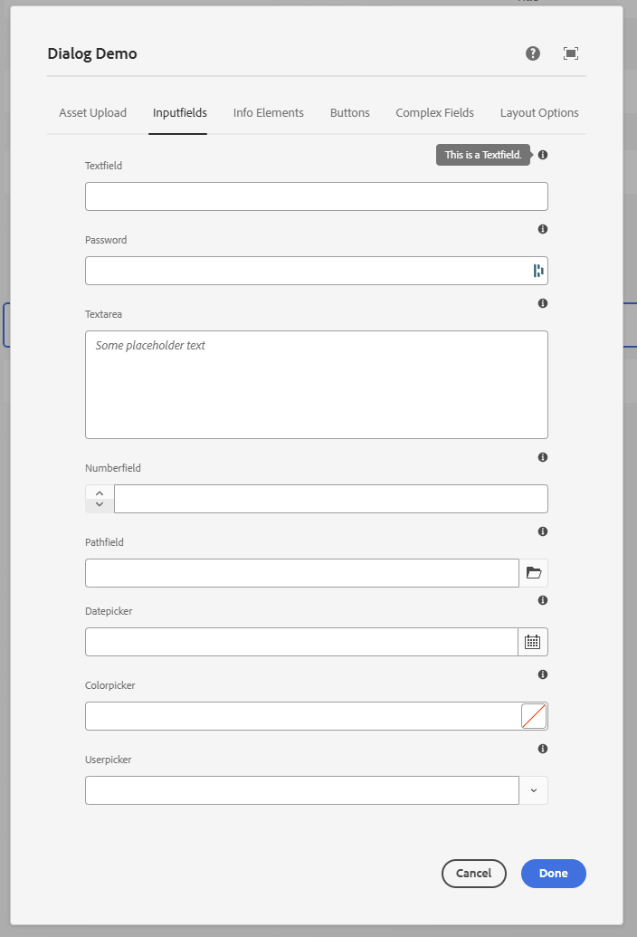
<?xml version="1.0" encoding="UTF-8"?>
<jcr:root xmlns:sling="http://sling.apache.org/jcr/sling/1.0" xmlns:granite="http://www.adobe.com/jcr/granite/1.0"
xmlns:jcr="http://www.jcp.org/jcr/1.0" xmlns:nt="http://www.jcp.org/jcr/nt/1.0"
xmlns:cq="http://www.day.com/jcr/cq/1.0"
jcr:primaryType="nt:unstructured"
jcr:title="Dialog Demo"
helpPath="/mnt/overlay/wcm/core/content/sites/components/details.html/apps/some-app/components/demo/v1/demo"
sling:resourceType="cq/gui/components/authoring/dialog">
<content
jcr:primaryType="nt:unstructured"
sling:resourceType="granite/ui/components/coral/foundation/container"
granite:class="cmp-container__editor">
<items jcr:primaryType="nt:unstructured">
<tabs
jcr:primaryType="nt:unstructured"
sling:resourceType="granite/ui/components/coral/foundation/tabs"
maximized="{Boolean}true">
<items jcr:primaryType="nt:unstructured"
sling:hideChildren="[*]">
<assetUpload
jcr:primaryType="nt:unstructured"
jcr:title="Asset Upload"
sling:resourceType="granite/ui/components/coral/foundation/container"
margin="{Boolean}true">
<items jcr:primaryType="nt:unstructured">
<columns
jcr:primaryType="nt:unstructured"
sling:resourceType="granite/ui/components/coral/foundation/fixedcolumns"
margin="{Boolean}true">
<items jcr:primaryType="nt:unstructured">
<column
jcr:primaryType="nt:unstructured"
sling:resourceType="granite/ui/components/coral/foundation/container">
<items jcr:primaryType="nt:unstructured">
<assetUpload
jcr:primaryType="nt:unstructured"
sling:resourceType="cq/gui/components/authoring/dialog/fileupload"
allowUpload="{Boolean}false"
autoStart="{Boolean}false"
class="cq-droptarget"
fileNameParameter="./fileName"
fileReferenceParameter="./fileReference"
mimeTypes="[image/gif,image/apng]"
multiple="{Boolean}false"
name="./file"
title="Upload Asset"
uploadUrl="${suffix.path}"
useHTML5="{Boolean}true"/>
</items>
</column>
</items>
</columns>
</items>
</assetUpload>
<inputfields
jcr:primaryType="nt:unstructured"
jcr:title="Inputfields"
sling:resourceType="granite/ui/components/coral/foundation/container"
margin="{Boolean}true">
<items jcr:primaryType="nt:unstructured">
<columns
jcr:primaryType="nt:unstructured"
sling:resourceType="granite/ui/components/coral/foundation/fixedcolumns"
margin="{Boolean}true">
<items jcr:primaryType="nt:unstructured">
<column
jcr:primaryType="nt:unstructured"
sling:resourceType="granite/ui/components/coral/foundation/container">
<items jcr:primaryType="nt:unstructured">
<textfield
jcr:primaryType="nt:unstructured"
sling:resourceType="granite/ui/components/coral/foundation/form/textfield"
fieldLabel="Textfield"
fieldDescription="This is a Textfield."
name="./textfield"/>
<password
jcr:primaryType="nt:unstructured"
sling:resourceType="granite/ui/components/coral/foundation/form/password"
fieldLabel="Password"
fieldDescription="This is a Password."
name="./password"/>
<textarea
jcr:primaryType="nt:unstructured"
sling:resourceType="granite/ui/components/coral/foundation/form/textarea"
fieldLabel="Textarea"
emptyText="Some placeholder text"
fieldDescription="This is a Textarea."
name="./textarea"/>
<numberfield
jcr:primaryType="nt:unstructured"
sling:resourceType="granite/ui/components/coral/foundation/form/numberfield"
fieldLabel="Numberfield"
fieldDescription="This is a Numberfield."
name="./numberfield"
min="{Long}1"
max="{Long}10"
step="{Double}1"/>
<pathfield
jcr:primaryType="nt:unstructured"
sling:resourceType="granite/ui/components/coral/foundation/form/pathfield"
fieldLabel="Pathfield"
fieldDescription="This is a Pathfield."
rootPath="/content"
name="./pathfield"/>
<datepicker
jcr:primaryType="nt:unstructured"
sling:resourceType="granite/ui/components/coral/foundation/form/datepicker"
displayedFormat="MM-DD-YYYY HH:mm"
fieldLabel="Datepicker"
fieldDescription="This is a Datepicker."
name="./datepicker"
type="datetime"
typeHint="Date"/>
<colorpicker
jcr:primaryType="nt:unstructured"
sling:resourceType="granite/ui/components/coral/foundation/form/colorfield"
fieldLabel="Colorpicker"
fieldDescription="This is a Colorpicker."
name="./colorpicker"/>
<userpicker
jcr:primaryType="nt:unstructured"
sling:resourceType="granite/ui/components/coral/foundation/form/userpicker"
fieldLabel="Userpicker"
fieldDescription="This is a Userpicker."
hideServiceUsers="{Boolean}true"
impersonatesOnly="{Boolean}false"
name="./userpicker"/>
</items>
</column>
</items>
</columns>
</items>
</inputfields>
<staticinfo
jcr:primaryType="nt:unstructured"
jcr:title="Info Elements"
sling:resourceType="granite/ui/components/coral/foundation/container"
margin="{Boolean}true">
<items jcr:primaryType="nt:unstructured">
<columns
jcr:primaryType="nt:unstructured"
sling:resourceType="granite/ui/components/coral/foundation/fixedcolumns"
margin="{Boolean}true">
<items jcr:primaryType="nt:unstructured">
<column
jcr:primaryType="nt:unstructured"
sling:resourceType="granite/ui/components/coral/foundation/container">
<items jcr:primaryType="nt:unstructured">
<heading1 jcr:primaryType="nt:unstructured"
sling:resourceType="granite/ui/components/coral/foundation/heading"
level="1"
text="Heading Level 1"/>
<heading2 jcr:primaryType="nt:unstructured"
sling:resourceType="granite/ui/components/coral/foundation/heading"
level="2"
text="Heading Level 2"/>
<heading3 jcr:primaryType="nt:unstructured"
sling:resourceType="granite/ui/components/coral/foundation/heading"
level="3"
text="Heading Level 3"/>
<heading4 jcr:primaryType="nt:unstructured"
sling:resourceType="granite/ui/components/coral/foundation/heading"
level="4"
text="Heading Level 4"/>
<heading5 jcr:primaryType="nt:unstructured"
sling:resourceType="granite/ui/components/coral/foundation/heading"
level="5"
text="Heading Level 5"/>
<heading6 jcr:primaryType="nt:unstructured"
sling:resourceType="granite/ui/components/coral/foundation/heading"
level="6"
text="Heading Level 6"/>
<text jcr:primaryType="nt:unstructured"
sling:resourceType="granite/ui/components/coral/foundation/text"
text="Lorem ipsum odor amet, consectetuer adipiscing elit. Blandit natoque porta sapien et dictumst tortor."/>
<alertInfo
granite:class="cmp-form-textfield-readonlyselected-alert"
jcr:primaryType="nt:unstructured"
sling:resourceType="granite/ui/components/coral/foundation/alert"
size="S"
jcr:title="Info"
text="Lorem ipsum odor amet, consectetuer adipiscing elit. Blandit natoque porta sapien et dictumst tortor. "
variant="info"/>
<alertError
granite:class="cmp-form-textfield-readonlyselected-alert"
jcr:primaryType="nt:unstructured"
sling:resourceType="granite/ui/components/coral/foundation/alert"
size="S"
jcr:title="Error"
text="Lorem ipsum odor amet, consectetuer adipiscing elit. Blandit natoque porta sapien et dictumst tortor. "
variant="error"/>
<alertWarning
granite:class="cmp-form-textfield-readonlyselected-alert"
jcr:primaryType="nt:unstructured"
sling:resourceType="granite/ui/components/coral/foundation/alert"
size="S"
jcr:title="Warning"
text="Lorem ipsum odor amet, consectetuer adipiscing elit. Blandit natoque porta sapien et dictumst tortor. "
variant="warning"/>
<alertSuccess
granite:class="cmp-form-textfield-readonlyselected-alert"
jcr:primaryType="nt:unstructured"
sling:resourceType="granite/ui/components/coral/foundation/alert"
size="S"
jcr:title="Success"
text="Lorem ipsum odor amet, consectetuer adipiscing elit. Blandit natoque porta sapien et dictumst tortor. "
variant="success"/>
<hyperlink
jcr:primaryType="nt:unstructured"
sling:resourceType="granite/ui/components/coral/foundation/hyperlink"
target="_blank"
rel="noopener noreferrer"
text="Granite Hyperlink Documentation"
icon="link"
href="https://developer.adobe.com/experience-manager/reference-materials/6-5/granite-ui/api/jcr_root/libs/granite/ui/components/coral/foundation/hyperlink/index.html"/>
</items>
</column>
</items>
</columns>
</items>
</staticinfo>
<buttons
jcr:primaryType="nt:unstructured"
jcr:title="Buttons"
sling:resourceType="granite/ui/components/coral/foundation/container"
margin="{Boolean}true">
<items jcr:primaryType="nt:unstructured">
<columns
jcr:primaryType="nt:unstructured"
sling:resourceType="granite/ui/components/coral/foundation/fixedcolumns"
margin="{Boolean}true">
<items jcr:primaryType="nt:unstructured">
<column
jcr:primaryType="nt:unstructured"
sling:resourceType="granite/ui/components/coral/foundation/container">
<items jcr:primaryType="nt:unstructured">
<anchorButton
jcr:primaryType="nt:unstructured"
sling:resourceType="granite/ui/components/coral/foundation/anchorbutton"
href="https://developer.adobe.com/experience-manager/reference-materials/6-5/coral-ui/coralui3/Coral.Icon.html#availableIcons"
text="Available Icons"
icon="adobe"
target="_blank"/>
<button
jcr:primaryType="nt:unstructured"
sling:resourceType="granite/ui/components/coral/foundation/button"
text="Button"
icon="Search"/>
<cyclebutton
jcr:primaryType="nt:unstructured"
sling:resourceType="granite/ui/components/coral/foundation/cyclebutton"
displayMode="text">
<items
jcr:primaryType="nt:unstructured">
<button1 jcr:primaryType="nt:unstructured" icon="search"
text="Button 1"/>
<button2 jcr:primaryType="nt:unstructured" icon="search"
text="Button 2"/>
<button3 jcr:primaryType="nt:unstructured" icon="search"
text="Button 3"/>
</items>
</cyclebutton>
<switch
jcr:primaryType="nt:unstructured"
sling:resourceType="granite/ui/components/coral/foundation/form/switch"
checked="true"
name="./switchValue"
uncheckedValue="false"
value="{Boolean}true"/>
<buttonGroup jcr:primaryType="nt:unstructured"
sling:resourceType="granite/ui/components/coral/foundation/form/buttongroup"
fieldLabel="Button Group"
selectionMode="single"
name="./buttonGroup">
<items jcr:primaryType="nt:unstructured">
<left jcr:primaryType="nt:unstructured"
name="./left"
text="Left"
value="left"
cq-msm-lockable="left"/>
<center jcr:primaryType="nt:unstructured"
name="./center"
text="Center"
value="center"
cq-msm-lockable="center"/>
<right jcr:primaryType="nt:unstructured"
name="./right"
text="Right"
value="right"
cq-msm-lockable="right"/>
</items>
</buttonGroup>
</items>
</column>
</items>
</columns>
</items>
</buttons>
<complexFormFields
jcr:primaryType="nt:unstructured"
jcr:title="Complex Fields"
sling:resourceType="granite/ui/components/coral/foundation/container"
margin="{Boolean}true">
<items jcr:primaryType="nt:unstructured">
<columns
jcr:primaryType="nt:unstructured"
sling:resourceType="granite/ui/components/coral/foundation/fixedcolumns"
margin="{Boolean}true">
<items jcr:primaryType="nt:unstructured">
<column
jcr:primaryType="nt:unstructured"
sling:resourceType="granite/ui/components/coral/foundation/container">
<items jcr:primaryType="nt:unstructured">
<select
jcr:primaryType="nt:unstructured"
sling:resourceType="granite/ui/components/coral/foundation/form/select"
fieldLabel="Select Dropdown"
fieldDescription="This is a Select Dropdown."
name="./select">
<items jcr:primaryType="nt:unstructured">
<item1
jcr:primaryType="nt:unstructured"
text="Item 1"
value="item1"/>
<item2
jcr:primaryType="nt:unstructured"
text="Item 2"
value="item2"/>
<item3
jcr:primaryType="nt:unstructured"
text="Item 3"
value="item3"/>
</items>
</select>
<radio
jcr:primaryType="nt:unstructured"
sling:resourceType="granite/ui/components/coral/foundation/form/radiogroup"
name="./radioselection"
vertical="{Boolean}true"
fieldLabel="Radio Select"
fieldDescription="This is a Radio Select.">
<items jcr:primaryType="nt:unstructured">
<vara
jcr:primaryType="nt:unstructured"
text="Variation A"
value="var-a"/>
<varb
jcr:primaryType="nt:unstructured"
text="Variation B"
value="var-b"/>
</items>
</radio>
<myMultifield
jcr:primaryType="nt:unstructured"
sling:resourceType="granite/ui/components/coral/foundation/form/multifield"
fieldLabel="Multifield"
fieldDescription="This is a Multifield."
composite="{Boolean}true">
<field
jcr:primaryType="nt:unstructured"
sling:resourceType="granite/ui/components/coral/foundation/container"
name="./values">
<items jcr:primaryType="nt:unstructured">
<textvalue
jcr:primaryType="nt:unstructured"
sling:resourceType="granite/ui/components/coral/foundation/form/textfield"
fieldLabel="Text Value"
fieldDescription="This is a Textfield."
name="./textvalue"/>
<numbervalue
jcr:primaryType="nt:unstructured"
sling:resourceType="granite/ui/components/coral/foundation/form/numberfield"
fieldLabel="Number Value"
fieldDescription="This is a Numberfield."
name="./numbervalue"/>
</items>
</field>
</myMultifield>
</items>
</column>
</items>
</columns>
</items>
</complexFormFields>
<layout
jcr:primaryType="nt:unstructured"
jcr:title="Layout Options"
sling:resourceType="granite/ui/components/coral/foundation/container"
margin="{Boolean}true">
<items jcr:primaryType="nt:unstructured">
<columns
jcr:primaryType="nt:unstructured"
sling:resourceType="granite/ui/components/coral/foundation/fixedcolumns"
margin="{Boolean}true">
<items jcr:primaryType="nt:unstructured">
<column
jcr:primaryType="nt:unstructured"
sling:resourceType="granite/ui/components/coral/foundation/container">
<items jcr:primaryType="nt:unstructured">
<wellText jcr:primaryType="nt:unstructured"
sling:resourceType="granite/ui/components/coral/foundation/text"
text="Well Group"/>
<wellGroup jcr:primaryType="nt:unstructured"
sling:resourceType="granite/ui/components/coral/foundation/well">
<items jcr:primaryType="nt:unstructured">
<textvalue1
jcr:primaryType="nt:unstructured"
sling:resourceType="granite/ui/components/coral/foundation/form/textfield"
fieldLabel="Text Value"
fieldDescription="This is a Textfield."
name="./textvalueWell"/>
<somenumber
jcr:primaryType="nt:unstructured"
sling:resourceType="granite/ui/components/coral/foundation/form/numberfield"
fieldLabel="Number Value"
fieldDescription="This is a Numberfield."
name="./numbervalue2Well"/>
</items>
</wellGroup>
<accordionText jcr:primaryType="nt:unstructured"
sling:resourceType="granite/ui/components/coral/foundation/text"
text="Accordion"/>
<accordion
jcr:primaryType="nt:unstructured"
sling:resourceType="granite/ui/components/coral/foundation/accordion"
fieldLabel="Accordion"
variant="default">
<items jcr:primaryType="nt:unstructured">
<block1
jcr:primaryType="nt:unstructured"
jcr:title="Some Category"
sling:resourceType="granite/ui/components/coral/foundation/container"
maximized="{Boolean}true">
<items jcr:primaryType="nt:unstructured">
<textvalue1
jcr:primaryType="nt:unstructured"
sling:resourceType="granite/ui/components/coral/foundation/form/textfield"
fieldLabel="Text Value"
fieldDescription="This is a Textfield."
name="./textvalueAccodion"/>
<textvalue2
jcr:primaryType="nt:unstructured"
sling:resourceType="granite/ui/components/coral/foundation/form/textfield"
fieldLabel="Text Value 2"
fieldDescription="This is a Textfield."
name="./textvalue2Accordion"/>
</items>
<parentConfig
jcr:primaryType="nt:unstructured"
active="{Boolean}true"/>
</block1>
<block2
jcr:primaryType="nt:unstructured"
jcr:title="Another Category"
sling:resourceType="granite/ui/components/coral/foundation/container"
maximized="{Boolean}true">
<items jcr:primaryType="nt:unstructured">
<numbervalue
jcr:primaryType="nt:unstructured"
sling:resourceType="granite/ui/components/coral/foundation/form/numberfield"
fieldLabel="Number Value"
fieldDescription="This is a Numberfield."
name="./numbervalue"/>
<numbervalue2
jcr:primaryType="nt:unstructured"
sling:resourceType="granite/ui/components/coral/foundation/form/numberfield"
fieldLabel="Number Value 2"
fieldDescription="This is a Numberfield."
name="./numbervalue2"/>
</items>
</block2>
</items>
</accordion>
</items>
</column>
</items>
</columns>
</items>
</layout>
</items>
</tabs>
</items>
</content>
</jcr:root>
Authoring UX tips
- Keep required fields early in the first tab.
- Use
fieldDescriptionfor guidance and examples. - Prefer smaller, focused tabs over a single long list.
- Keep names stable; renaming properties impacts existing content.
- Use
granite:classsparingly to improve spacing or emphasis.
Accessibility
The Touch UI dialog (Coral) is keyboard- and screen-reader-accessible out of the box, but only if you use the framework correctly. A few rules keep dialogs usable for everyone on the authoring team:
- Always set
fieldLabel. ThefieldGranite UI component wires the label to the input viaaria-labelledbyusing a generatedlabelId(Granite UIfieldcontract). A field with nofieldLabelis unlabelled for screen readers. - Use
fieldDescriptionfor instructions, not a separatetextwidget. The description is associated with the field (aria-describedby), so assistive tech reads it together with the label. - Don't rely on colour alone. The invalid state adds the
is-invalidclass and an error tooltip with text - keep that text meaningful (see Dialog Validation). - Prefer Coral/Granite widgets over raw HTML in the dialog. Hand-rolled markup in a
textwidget bypasses Coral's focus management and ARIA handling. - Keep a logical tab order. Author tab order follows DOM order, so order your
itemsthe way you want the author to traverse them; avoid using CSS to visually reorder fields. - Label icon-only controls. If you add custom buttons via clientlibs, give them an accessible
name (
aria-labelor visible text).
See Adobe's Coral UI notes and the Granite UI server-side API for the underlying accessibility contracts.