Touch UI Component Dialog Examples
The following chapters each present a Coral XML snippet which can be copied into any /components/mycomponent/_cq_dialog/.content.xml file.
TL;DR
- Start from the empty dialog template and evolve it.
- Use
fieldLabel+fieldDescriptionconsistently for author guidance. - Prefer
compositemultifields and@ChildResourcewhen you need structured data. - Keep validation minimal and handle missing values in your Sling Model.
Quick navigation
- AEM Component Help Pages
- Best Practices
- Empty Dialog / Starting Point
- Simple Data Fields
- Complex Data Fields
- Validation
- Dialog Inheritance
- Design Dialog (Template Policies)
- Layout & Read Only
- Full XML Example
AEM Component Help Pages
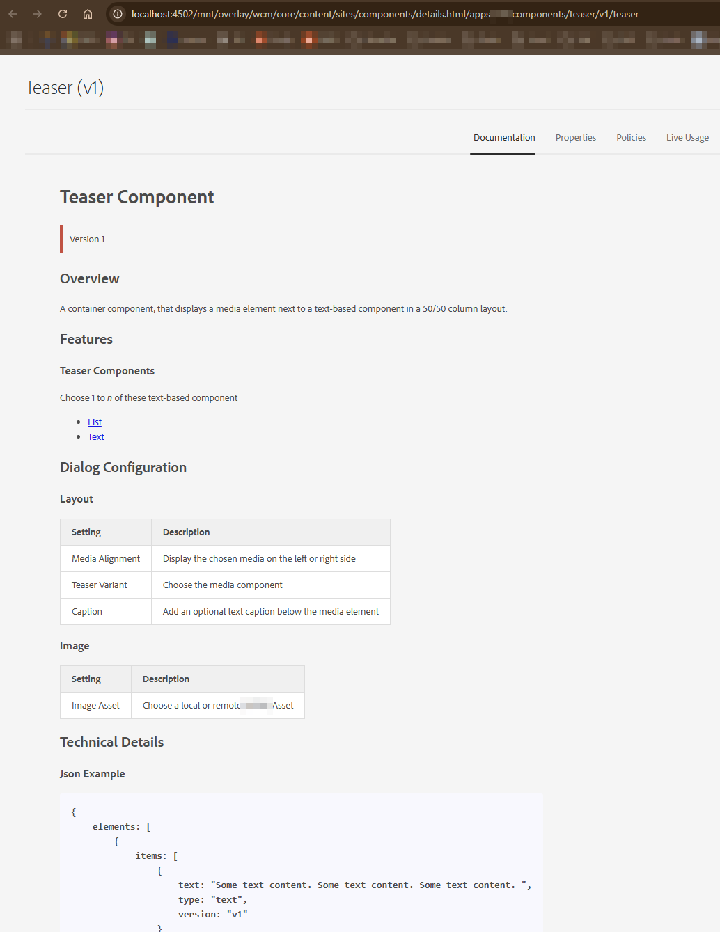
- Open the CRXDE http://localhost:4502/crx/de/index.jsp console.
- Go to the component path. Example:
/apps/<projectname>/components/some/text. - Now create a new markdown file inside the component called README.md.
- Add any documentation content you need.
- Now go to http://localhost:4502/libs/wcm/core/content/sites/components.html and select Title Component from the list with a valid Component Group.
- Now copy the URL from the address bar. In my case the URL is
/mnt/overlay/wcm/core/content/sites/components/details.html/apps/<projectname>/components/some/text. - Go to the component within CRXDE Lite > cq:dialog and set the helpPath property to the value of the path copied above.
helpPath="/mnt/overlay/wcm/core/content/sites/components/details.html/apps/<projectname>/components/some/text"
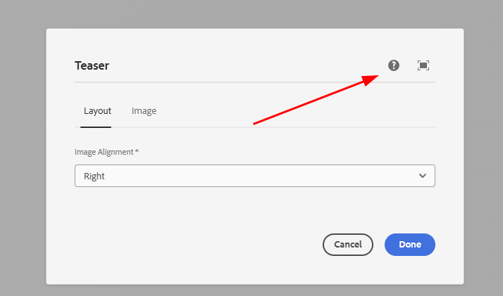
- Now enable and add the component to the page, open the dialog and click on the Help (?) icon.
Set Documentation as Default Active Tab
In order to show documentation as the default active tab when the author clicks on the Help (?) icon, We need to overlay an AEM’s node. Just follow these steps.
- Go to the CRXDE Lite console http://localhost:4502/crx/de/index.jsp
- Go to
/libs/wcm/core/content/sites/components/details/jcr:content/content/single/content/items/content/items/tabs/items/documentation. - Right click on the documentation node and select the Overlay Node option.
- Path:
/libs/wcm/core/content/sites/components/details/jcr:content/content/single/content/items/content/items/tabs/items/documentation - Overlay Location:
/apps/ - Match node types:
checked
- Now go to the overlay path inside the /apps folder
/apps/wcm/core/content/sites/components/details/jcr:content/content/single/content/items/content/items/tabs/items/documentation. Click on the documentation node and set the following propertysling:orderBefore (String) : fixedColumnContainer
ui.apps/src/main/content/jcr_root/apps/wcm/core/content/sites/components/details/.content.xml
<?xml version="1.0" encoding="UTF-8"?>
<jcr:root xmlns:jcr="http://www.jcp.org/jcr/1.0" xmlns:nt="http://www.jcp.org/jcr/nt/1.0"
          xmlns:cq="http://www.day.com/jcr/cq/1.0"
          xmlns:sling="http://sling.apache.org/jcr/sling/1.0"
          jcr:primaryType="cq:Page">
    <jcr:content
        jcr:primaryType="nt:unstructured">
        <content
            jcr:primaryType="nt:unstructured">
            <single jcr:primaryType="nt:unstructured">
                <content
                    jcr:primaryType="nt:unstructured">
                    <items jcr:primaryType="nt:unstructured">
                        <content
                            jcr:primaryType="nt:unstructured">
                            <items jcr:primaryType="nt:unstructured">
                                <tabs
                                    jcr:primaryType="nt:unstructured">
                                    <items jcr:primaryType="nt:unstructured">
                                        <documentation
                                            jcr:primaryType="nt:unstructured"
                                            sling:orderBefore="fixedColumnContainer"/>
                                    </items>
                                </tabs>
                            </items>
                        </content>
                    </items>
                </content>
            </single>
        </content>
    </jcr:content>
</jcr:root>
Best Practices
- If possible, extend an existing core component.
- Version your components
<component>/<version>/<component>. - Structure your fields into tabs where it makes sense
- Do not overuse multifields
- Use as few fields as possible, but as many as necessary
- Use Granite Alerts for important hints or notes
- Use granite wells where fields could be visually grouped.
- Add a component README.md file to help authors
- Add clientLib files directly into the component folder if necessary
- Don't overdo validation, handle missing fields gracefully in the model as well
Common pitfalls
- Missing
nameor missing./prefix, which leads to values not being persisted. - Forgetting
fieldLabel, which makes dialogs harder to scan. - Overusing multifields instead of grouping into separate components.
- Applying clientlibs globally instead of using dialog-specific categories.
Empty Dialog / Starting Point
This is an empty dialog structure and components can be placed in tabs (you can add n tabs.)

<?xml version="1.0" encoding="UTF-8"?>
<jcr:root xmlns:sling="http://sling.apache.org/jcr/sling/1.0" xmlns:granite="http://www.adobe.com/jcr/granite/1.0" xmlns:cq="http://www.day.com/jcr/cq/1.0" xmlns:jcr="http://www.jcp.org/jcr/1.0" xmlns:nt="http://www.jcp.org/jcr/nt/1.0"
          jcr:primaryType="nt:unstructured"
          jcr:title="MyTestComponent"
          sling:resourceType="cq/gui/components/authoring/dialog"
          helpPath="https://url-to-your-documentation.com">
    <content
            granite:class="cmp-mytestcmp__editor"
            jcr:primaryType="nt:unstructured"
            sling:resourceType="granite/ui/components/coral/foundation/container">
        <items jcr:primaryType="nt:unstructured">
            <tabs
                    jcr:primaryType="nt:unstructured"
                    sling:resourceType="granite/ui/components/coral/foundation/tabs"
                    maximized="{Boolean}true">
                <items jcr:primaryType="nt:unstructured">
                    <properties
                            jcr:primaryType="nt:unstructured"
                            jcr:title="Properties"
                            sling:resourceType="granite/ui/components/coral/foundation/container"
                            margin="{Boolean}true">
                        <items jcr:primaryType="nt:unstructured">
                            <columns
                                    jcr:primaryType="nt:unstructured"
                                    sling:resourceType="granite/ui/components/coral/foundation/fixedcolumns"
                                    margin="{Boolean}true">
                                <items jcr:primaryType="nt:unstructured">
                                    <column
                                            jcr:primaryType="nt:unstructured"
                                            sling:resourceType="granite/ui/components/coral/foundation/container">
                                        <items jcr:primaryType="nt:unstructured">
                                        <!--  Place your components / dialog fields here  -->
                                        </items>
                                    </column>
                                </items>
                            </columns>
                        </items>
                    </properties>
                    <layout
                            jcr:primaryType="nt:unstructured"
                            jcr:title="Layout"
                            sling:resourceType="granite/ui/components/coral/foundation/container"
                            margin="{Boolean}true">
                        <items jcr:primaryType="nt:unstructured">
                            <columns
                                    jcr:primaryType="nt:unstructured"
                                    sling:resourceType="granite/ui/components/coral/foundation/fixedcolumns"
                                    margin="{Boolean}true">
                                <items jcr:primaryType="nt:unstructured">
                                    <column
                                            jcr:primaryType="nt:unstructured"
                                            sling:resourceType="granite/ui/components/coral/foundation/container">
                                        <items jcr:primaryType="nt:unstructured">
                                        <!--  Place your components / dialog fields here  -->
                                        </items>
                                    </column>
                                </items>
                            </columns>
                        </items>
                    </layout>
                </items>
            </tabs>
        </items>
    </content>
</jcr:root>
See also
- Custom Component Guide
- Dialog validation
- Components
- Core Components
- HTL Templates
- Touch UI
- Coral UI
- Overlays
- Sling Models -- reading policy values
- Custom dialog widgets (dynamic rootpath, asset finder)
- Templates and Policies -- design dialogs, component policies
- Tags and Taxonomies -- tag field deep dive
- Granite UI Server-side API
- Coral UI Icon List

You can write a class or id to your dialog fragment by adding granite:class="some-css-class" or granite:id="some-id". Add required="{Boolean}true" to any component field to mark it as required.
Note, that the actual xml item element tag name, can be anything, as long as its unique for this component.
For example, the Alert field xml does not need to be named alert.
Simple Data Fields
Textfield
<textfield
   jcr:primaryType="nt:unstructured"
   sling:resourceType="granite/ui/components/coral/foundation/form/textfield"
   fieldDescription="The button label"
   fieldLabel="Button Label"
   name="./label"/>

Textarea
<textarea
   jcr:primaryType="nt:unstructured"
   sling:resourceType="granite/ui/components/coral/foundation/form/textarea"
   fieldLabel="This is a text area"
   emptyText="Please add your descriptive text"
   name="./textareacontent"/>

Hidden
<hidden
    jcr:primaryType="nt:unstructured"
    sling:resourceType="granite/ui/components/coral/foundation/form/hidden"
    name="./source"
    value="author-ui"/>
Numberfield
You can define the min, max value and the increments, in which the input can be set.
<numberfield
    jcr:primaryType="nt:unstructured"
    sling:resourceType="granite/ui/components/coral/foundation/form/numberfield"
    fieldLabel="Choose a number value"
    name="./numbervalue"
    min="{Long}1"
    max="{Long}10"
    step="{Double}1"/>

Pathfield (Pathbrowser)
<pathfield
   jcr:primaryType="nt:unstructured"
   sling:resourceType="granite/ui/components/coral/foundation/form/pathfield"
   fieldLabel="Select path"
   rootpath="/content"
   name="./path"/>

Pathfield picker options
<pathfield
   jcr:primaryType="nt:unstructured"
   sling:resourceType="granite/ui/components/coral/foundation/form/pathfield"
   fieldLabel="Select asset"
   forceSelection="{Boolean}true"
   rootPath="/content/dam"
   pickerSrc="/mnt/overlay/granite/ui/content/coral/foundation/form/pathfield/picker.html"
   name="./assetPath"/>
For an implementation of a dynamic rootPath, see Custom Dialog Widgets -- Dynamic PathField.
Pathbrowser
In some cases you might want to use the older coral2 pathbrowser component https://experienceleaguecommunities.adobe.com/t5/adobe-experience-manager/when-to-choice-pathbrowser-as-well-as-pathfield/m-p/312540/highlight/true#M32451.
You can recognize the Coral 3 components by the path /components/coral/foundation. The older Coral 2 variants live
in /components/foundation.
<pathbrowser
   jcr:primaryType="nt:unstructured"
   sling:resourceType="granite/ui/components/foundation/form/pathbrowser"
   fieldLabel="Select asset"
   rootpath="/content/dam"
   name="./assetpath"/>

Asset Upload
<file
    jcr:primaryType="nt:unstructured"
    sling:resourceType="cq/gui/components/authoring/dialog/fileupload"
    class="cq-droptarget"
    fileNameParameter="./fileName"
    fileReferenceParameter="./fileReference"
    mimeTypes="[image/gif,image/jpeg,image/png,image/tiff,image/svg+xml]"
    name="./file"/>

Checkbox
<checkbox
    jcr:primaryType="nt:unstructured"
    sling:resourceType="granite/ui/components/coral/foundation/form/checkbox"
    checked="true"
    name="./altValueFromPageImage"
    text="Inherit alternative text from page"
    uncheckedValue="false"
    value="{Boolean}true"/>

Checkbox group
<checkboxGroup
    jcr:primaryType="nt:unstructured"
    sling:resourceType="granite/ui/components/coral/foundation/form/checkboxgroup"
    fieldLabel="Options"
    name="./options">
    <items jcr:primaryType="nt:unstructured">
        <optA text="Option A" value="a" jcr:primaryType="nt:unstructured"/>
        <optB text="Option B" value="b" jcr:primaryType="nt:unstructured"/>
    </items>
</checkboxGroup>
Switch
<switch
   jcr:primaryType="nt:unstructured"
   sling:resourceType="granite/ui/components/coral/foundation/form/switch"
   checked="true"
   name="./switchValue"
   fieldLabel="Toggle Me"
   uncheckedValue="false"
   value="{Boolean}true"/>

Switch with labels
<switch
   jcr:primaryType="nt:unstructured"
   sling:resourceType="granite/ui/components/coral/foundation/form/switch"
   fieldLabel="Enable feature"
   onText="On"
   offText="Off"
   name="./featureEnabled"
   uncheckedValue="false"
   value="{Boolean}true"/>
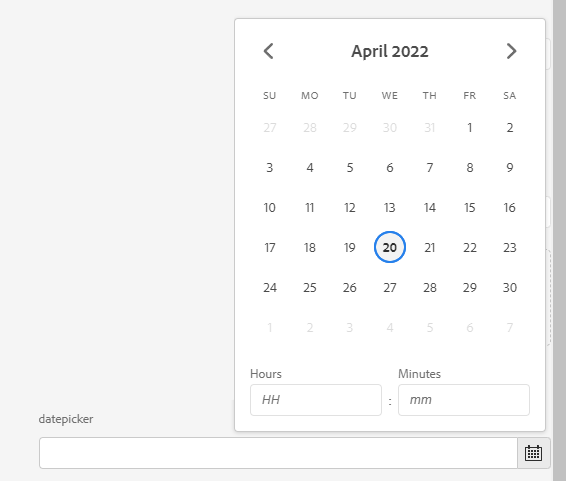
Datepicker
<datepicker
   jcr:primaryType="nt:unstructured"
   sling:resourceType="granite/ui/components/coral/foundation/form/datepicker"
   displayedFormat="MM-DD-YYYY HH:mm"
   fieldLabel="datepicker"
   name="./datepicker"
   type="datetime"
   typeHint="Date"/>
Datepicker constraints
<datepicker
   jcr:primaryType="nt:unstructured"
   sling:resourceType="granite/ui/components/coral/foundation/form/datepicker"
   fieldLabel="Publish date"
   minDate="2024-01-01"
   maxDate="2030-12-31"
   displayedFormat="YYYY-MM-DD"
   name="./publishDate"/>
Colorfield
<colorpicker
    jcr:primaryType="nt:unstructured"
    sling:resourceType="granite/ui/components/coral/foundation/form/colorfield"
    fieldLabel="Brand Color"
    name="./brandColor"
    showDefaultColors="{Boolean}true"
    showProperties="{Boolean}true"
    showSwatches="{Boolean}true"/>
You can also restrict to a predefined palette by providing custom swatches:
<colorpicker
    jcr:primaryType="nt:unstructured"
    sling:resourceType="granite/ui/components/coral/foundation/form/colorfield"
    fieldLabel="Theme Color"
    name="./themeColor"
    showProperties="{Boolean}false"
    showSwatches="{Boolean}true"
    showDefaultColors="{Boolean}false">
    <items jcr:primaryType="nt:unstructured">
        <primary jcr:primaryType="nt:unstructured" value="#0055FF"/>
        <secondary jcr:primaryType="nt:unstructured" value="#FF6600"/>
        <dark jcr:primaryType="nt:unstructured" value="#333333"/>
    </items>
</colorpicker>
Password
<password
    jcr:primaryType="nt:unstructured"
    sling:resourceType="granite/ui/components/coral/foundation/form/password"
    fieldLabel="API Key"
    fieldDescription="Stored as plain text in the JCR -- consider using OSGi configs for secrets"
    name="./apiKey"/>
Dialog passwords are stored as plain text in the JCR. For actual secrets, use OSGi secret configurations or context-aware configurations instead.
Button Group
A visual toggle group, useful for alignment or variant selection. Set selectionMode to single, multiple, or none.
<alignment
    jcr:primaryType="nt:unstructured"
    sling:resourceType="granite/ui/components/coral/foundation/form/buttongroup"
    fieldLabel="Text Alignment"
    selectionMode="single"
    name="./alignment">
    <items jcr:primaryType="nt:unstructured">
        <left  jcr:primaryType="nt:unstructured" text="Left"   value="left"   icon="textLeft"/>
        <center jcr:primaryType="nt:unstructured" text="Center" value="center" icon="textCenter" checked="{Boolean}true"/>
        <right jcr:primaryType="nt:unstructured" text="Right"  value="right"  icon="textRight"/>
    </items>
</alignment>
Userpicker
<userpicker
    jcr:primaryType="nt:unstructured"
    sling:resourceType="granite/ui/components/coral/foundation/form/userpicker"
    fieldLabel="User Picker"
    hideServiceUsers="{Boolean}true"
    impersonatesOnly="{Boolean}false"
    name="./user"/>

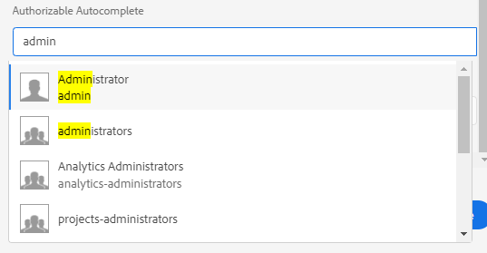
Authorizable Autocomplete
<authautocomplete
    jcr:primaryType="nt:unstructured"
    sling:resourceType="granite/ui/components/coral/foundation/authorizable/autocomplete"
    fieldLabel="User Picker"
    name="./user"/>
Complex Data Fields
Conditional fields (show/hide)
Use a render condition when you need server-side control (for example, permissions or site-level logic).
<advancedSettings
    jcr:primaryType="nt:unstructured"
    sling:resourceType="granite/ui/components/coral/foundation/container">
    <granite:rendercondition
        jcr:primaryType="nt:unstructured"
        sling:resourceType="com.myproject/renderconditions/isAdmin"/>
    <items jcr:primaryType="nt:unstructured">
        <!-- advanced fields -->
    </items>
</advancedSettings>
For client-side toggles (show/hide based on a checkbox or select), prefer dialog JS in a small clientlib scoped to dialog usage.
Dynamic show/hide based on a selection
When one widget controls the visibility of another, you can use dialog JS that reacts to the field value and toggles containers.
1) Add a controller field and a target container
<variant
    jcr:primaryType="nt:unstructured"
    sling:resourceType="granite/ui/components/coral/foundation/form/radiogroup"
    granite:class="some-radiogroup-source"
    fieldLabel="Variant"
    name="./variant">
    <items jcr:primaryType="nt:unstructured">
        <simple jcr:primaryType="nt:unstructured" text="Simple" value="simple"/>
        <advanced jcr:primaryType="nt:unstructured" text="Advanced" value="advanced"/>
    </items>
</variant>

<advancedOptions
    jcr:primaryType="nt:unstructured"
    sling:resourceType="granite/ui/components/coral/foundation/container"
    granite:class="cmp-dialog-advanced"
    margin="{Boolean}true">
    <items jcr:primaryType="nt:unstructured">
        <!-- fields shown only when variant=advanced -->
    </items>
</advancedOptions>
2) Add a dialog-scoped clientlib
<?xml version="1.0" encoding="UTF-8"?>
<jcr:root xmlns:cq="http://www.day.com/jcr/cq/1.0"
          xmlns:jcr="http://www.jcp.org/jcr/1.0"
          jcr:primaryType="cq:ClientLibraryFolder"
          categories="[cq.authoring.dialog]"
          allowProxy="{Boolean}true"/>
Alternatively, load the clientlib specifically only in the components dialog, by adding changing the categories propety to a custom name categories="[cq.authoring.mycomponent]" and
the extraClientlibs="[cq.authoring.mycomponent]" property to its /cq:dialog/.content.xml file.
<?xml version="1.0" encoding="UTF-8"?>
<jcr:root xmlns:jcr="http://www.jcp.org/jcr/1.0" xmlns:nt="http://www.jcp.org/jcr/nt/1.0"
          xmlns:granite="http://www.adobe.com/jcr/granite/1.0"
          xmlns:cq="http://www.day.com/jcr/cq/1.0" xmlns:sling="http://sling.apache.org/jcr/sling/1.0"
          jcr:primaryType="nt:unstructured"
          jcr:title="My Component"
          extraClientlibs="[cq.authoring.mycomponent]"
          sling:resourceType="cq/gui/components/authoring/dialog">
<!-- [...] -->
#base=js
dialog-visibility.js
3) Toggle visibility in JS
Following JQuery Example is for a multifield which has a select dropdown "linkType"
(function (window, document, Granite, $) {
    "use strict"

    /**
     * Initializes the link type source dropdown elements by attaching event handlers for visibility toggling
     * and ensuring a proper initial state for target elements based on dropdown values.
     *
     * This method performs the following actions:
     * - Selects all elements matching the selector `.coral-select.linkType-showhide-source`.
     * - Skips initialization for elements already marked as initialized.
     * - Toggles the visibility of `.linkType-showhide-target` elements based on the selected dropdown value.
     * - Handles dynamic multifield scenarios by adjusting the visibility of DOM elements through CSS.
     *
     * @return {void} This method does not return a value.
     */
    const initializeLinkTypeSources = function () {
        // Find all .class marked input fields
        const linkTypeSources = $('coral-select.linkType-showhide-source');
        if (!linkTypeSources.length) {
            return;
        }

        linkTypeSources.each((index, select) => {
            const $select = $(select);

            // Skip if already initialized
            if ($select.data('linktype-initialized')) {
                return;
            }
            $select.data('linktype-initialized', true);

            /**
             * Controls the visibility of a target element in the DOM based on the selected value
             * in a dropdown menu. Specifically, this function:
             * - Finds the closest `.coral-Well` container relative to the selected dropdown.
             * - Locates the `.linkType-showhide-target` element within the well to determine
             *   the corresponding target element.
             * - Toggles the target element's visibility based on the value of the dropdown menu.
             *
             * @function toggleTarget
             * @description Dynamically toggles the visibility of an element, typically used
             *              in cases such as multifield item handling or conditional UI display.
             */
            const toggleTarget = function () {
                const value = select.value;
                const well = $select.closest('div.coral-Well');
                const target = well.find('.linkType-showhide-target')?.closest('div.coral-Form-fieldwrapper');
                console.log("target", target);
                if (!target.length) {
                    return;
                }

                // We have to show/hide via css, since newly added multifield items would otherwise always show the query textarea
                if (value === 'mail') {
                    target.css('display', 'block');
                } else {
                    target.css('display', 'none');
                }
            };

            // Show/Hide on Dialog-Ready
            toggleTarget();

            // Show/Hide on Select Change Events
            $select.on('change', function (event) {
                toggleTarget();
            });
        });
    };

    $(document).on('dialog-ready', (event) => {
        initializeLinkTypeSources();

        // Watch for multifield item changes (add/remove coral-multifield-item)
        const multifields = document.querySelectorAll('coral-multifield');
        multifields.forEach((multifield) => {
            const observer = new MutationObserver((mutations) => {
                mutations.forEach((mutation) => {
                    if (mutation.type === 'childList') {
                        // Re-initialize when coral-multifield-item is added or removed
                        initializeLinkTypeSources();
                    }
                });
            });

            observer.observe(multifield, {
                childList: true,
                subtree: false
            });
        });
    });
})(window, document, Granite, $);
Select Dropdown
<select
        jcr:primaryType="nt:unstructured"
        sling:resourceType="granite/ui/components/coral/foundation/form/select"
        fieldLabel="List Item"
        name="./selectItem">
    <items jcr:primaryType="nt:unstructured">
        <children
                jcr:primaryType="nt:unstructured"
                text="Child pages"
                value="children"/>
        <static
                jcr:primaryType="nt:unstructured"
                text="Fixed list"
                value="static"/>
        <search
                jcr:primaryType="nt:unstructured"
                text="Search"
                value="search"/>
        <tags
                jcr:primaryType="nt:unstructured"
                text="Tags"
                value="tags"/>
    </items>
</select>
Open

Closed

Select with datasource
<categorySelect
    jcr:primaryType="nt:unstructured"
    sling:resourceType="granite/ui/components/coral/foundation/form/select"
    fieldLabel="Category"
    name="./category">
    <datasource
        jcr:primaryType="nt:unstructured"
        sling:resourceType="/apps/myproject/datasource/categories"/>
    <items jcr:primaryType="nt:unstructured"/>
</categorySelect>
Radio Select
<radio
        jcr:primaryType="nt:unstructured"
        sling:resourceType="granite/ui/components/coral/foundation/form/radiogroup"
        name="./radioselection"
        vertical="{Boolean}true"
        fieldLabel="Radio Select">
    <items jcr:primaryType="nt:unstructured">
        <vara
                jcr:primaryType="nt:unstructured"
                text="Variation A"
                value="var-a"/>
        <varb
                jcr:primaryType="nt:unstructured"
                text="Variation B"
                value="var-b"/>
    </items>
</radio>

Coral 3 radio group (explicit)
<variant
    jcr:primaryType="nt:unstructured"
    sling:resourceType="granite/ui/components/coral/foundation/form/radiogroup"
    fieldLabel="Variant"
    name="./variant">
    <items jcr:primaryType="nt:unstructured">
        <simple text="Simple" value="simple" jcr:primaryType="nt:unstructured"/>
        <advanced text="Advanced" value="advanced" jcr:primaryType="nt:unstructured"/>
    </items>
</variant>
Datasource-backed fields
For dynamic values, provide a datasource resource type. This works well for autocomplete and selects.
<customValue
    jcr:primaryType="nt:unstructured"
    sling:resourceType="granite/ui/components/coral/foundation/form/autocomplete"
    fieldLabel="Backend-driven values"
    name="./customValue"
    emptyText="Pick a value"
    multiple="{Boolean}false">
    <datasource
        jcr:primaryType="nt:unstructured"
        sling:resourceType="/apps/myproject/datasource/customstrings"/>
    <options
        jcr:primaryType="nt:unstructured"
        sling:resourceType="granite/ui/components/coral/foundation/form/autocomplete/list"/>
</customValue>
Multifield
A multifield wraps a predefined group of components and lets an author create n of these sets. The data will be saved to subnodes.
Access that data via @ChildResource Annotation in your Sling Model, as described here.
Add composite="{Boolean}true" to save the entries as a child node which in return can easily be injected into a Sling Model via @ChildResource.
Otherwise all values entered will be stored on the node itself as Array Properties.
Multifield validation (min/max)
<links
    jcr:primaryType="nt:unstructured"
    sling:resourceType="granite/ui/components/coral/foundation/form/multifield"
    composite="{Boolean}true">
    <granite:data
        jcr:primaryType="nt:unstructured"
        min-items="1"
        max-items="5"/>
    <field
        jcr:primaryType="nt:unstructured"
        sling:resourceType="granite/ui/components/coral/foundation/container"
        name="./links">
        <items jcr:primaryType="nt:unstructured">
            <textvalue
                jcr:primaryType="nt:unstructured"
                sling:resourceType="granite/ui/components/coral/foundation/form/textfield"
                fieldLabel="Link Text"
                name="./text"/>
        </items>
    </field>
</links>
<myMultifield
    jcr:primaryType="nt:unstructured"
    sling:resourceType="granite/ui/components/coral/foundation/form/multifield"
    composite="{Boolean}true"
    required="{Boolean}true">
    <field
        jcr:primaryType="nt:unstructured"
        sling:resourceType="granite/ui/components/coral/foundation/container"
        name="./values">
        <items jcr:primaryType="nt:unstructured">
            <textvalue
                jcr:primaryType="nt:unstructured"
                sling:resourceType="granite/ui/components/coral/foundation/form/textfield"
                fieldLabel="Text Value"
                name="./textvalue"/>
            <numbervalue
                 jcr:primaryType="nt:unstructured"
                 sling:resourceType="granite/ui/components/coral/foundation/form/numberfield"
                 fieldLabel="Number Value"
                 name="./numbervalue"/>
        </items>
    </field>
</myMultifield>
Accordion
You can add a parentConfig block with active to set the accordion to be opened by default.
Any dialog field can be added to each accordion item items block.
<accordion
        jcr:primaryType="nt:unstructured"
        sling:resourceType="granite/ui/components/coral/foundation/accordion"
        variant="default">
    <items jcr:primaryType="nt:unstructured">
        <block1
                jcr:primaryType="nt:unstructured"
                jcr:title="Some Category"
                sling:resourceType="granite/ui/components/coral/foundation/container"
                maximized="{Boolean}true">
            <items jcr:primaryType="nt:unstructured">
                <textvalue1
                        jcr:primaryType="nt:unstructured"
                        sling:resourceType="granite/ui/components/coral/foundation/form/textfield"
                        fieldLabel="Text Value"
                        name="./textvalue"/>
                <textvalue2
                        jcr:primaryType="nt:unstructured"
                        sling:resourceType="granite/ui/components/coral/foundation/form/textfield"
                        fieldLabel="Text Value 2"
                        name="./textvalue2"/>
            </items>
            <parentConfig
               jcr:primaryType="nt:unstructured"
               active="{Boolean}true"/>
        </block1>
        <block2
                jcr:primaryType="nt:unstructured"
                jcr:title="Another Category"
                sling:resourceType="granite/ui/components/coral/foundation/container"
                maximized="{Boolean}true">
            <items jcr:primaryType="nt:unstructured">
                <numbervalue
                        jcr:primaryType="nt:unstructured"
                        sling:resourceType="granite/ui/components/coral/foundation/form/numberfield"
                        fieldLabel="Number Value"
                        name="./numbervalue"/>
                <numbervalue2
                        jcr:primaryType="nt:unstructured"
                        sling:resourceType="granite/ui/components/coral/foundation/form/numberfield"
                        fieldLabel="Number Value 2"
                        name="./numbervalue2"/>
            </items>
        </block2>
    </items>
</accordion>

Tags field
<tags
    jcr:primaryType="nt:unstructured"
    sling:resourceType="cq/gui/components/coral/common/form/tagfield"
    fieldLabel="Tags"
    name="./cq:tags"
    multiple="{Boolean}true"/>
Content Fragment picker
Select a Content Fragment by path. Useful for headless or structured-content components.
<contentFragment
    jcr:primaryType="nt:unstructured"
    sling:resourceType="granite/ui/components/coral/foundation/form/pathfield"
    fieldLabel="Content Fragment"
    fieldDescription="Select a Content Fragment"
    rootPath="/content/dam"
    filter="hierarchyNotFile"
    name="./fragmentPath"/>
For a picker that restricts to a specific CF model, use a datasource or render condition in your project.
Experience Fragment picker
<experienceFragment
    jcr:primaryType="nt:unstructured"
    sling:resourceType="granite/ui/components/coral/foundation/form/pathfield"
    fieldLabel="Experience Fragment"
    rootPath="/content/experience-fragments"
    name="./experienceFragmentPath"/>
Validation
Regex validation
Add a validation node with a regex pattern to enforce input format:
<email
    jcr:primaryType="nt:unstructured"
    sling:resourceType="granite/ui/components/coral/foundation/form/textfield"
    fieldLabel="Email Address"
    name="./email"
    required="{Boolean}true">
    <granite:data
        jcr:primaryType="nt:unstructured"
        foundation-validation=""/>
    <validation
        jcr:primaryType="nt:unstructured"
        sling:resourceType="granite/ui/components/coral/foundation/form/validation"
        pattern="^[a-zA-Z0-9._%+-]+@[a-zA-Z0-9.-]+\.[a-zA-Z]{2,}$"
        patternMessage="Please enter a valid email address"/>
</email>
Built-in validators
Granite provides these validation types out of the box, set via the validation attribute on a field:
| Validator | Description |
|---|---|
| (none) | No validation, only required is checked if set |
foundation.jcr.name | Valid JCR node name |
foundation.url | Valid URL format |
foundation.email | Valid email format |
foundation.number | Numeric value |
<linkUrl
    jcr:primaryType="nt:unstructured"
    sling:resourceType="granite/ui/components/coral/foundation/form/textfield"
    fieldLabel="Link URL"
    name="./linkUrl"
    validation="foundation.url"/>
Max length on textfield
<title
    jcr:primaryType="nt:unstructured"
    sling:resourceType="granite/ui/components/coral/foundation/form/textfield"
    fieldLabel="Title"
    name="./title"
    maxlength="{Long}80"/>
Dialog Inheritance
Extending a parent dialog with sling:resourceSuperType
When your component extends another (e.g. a core component), its dialog can inherit from the parent. Fields, tabs, and structure are merged automatically.
<?xml version="1.0" encoding="UTF-8"?>
<jcr:root xmlns:sling="http://sling.apache.org/jcr/sling/1.0"
          xmlns:jcr="http://www.jcp.org/jcr/1.0"
          xmlns:nt="http://www.jcp.org/jcr/nt/1.0"
          jcr:primaryType="nt:unstructured"
          jcr:title="My Text"
          sling:resourceType="cq/gui/components/authoring/dialog">
    <content jcr:primaryType="nt:unstructured"
             sling:resourceType="granite/ui/components/coral/foundation/container">
        <items jcr:primaryType="nt:unstructured">
            <tabs jcr:primaryType="nt:unstructured"
                  sling:resourceType="granite/ui/components/coral/foundation/tabs"
                  maximized="{Boolean}true">
                <items jcr:primaryType="nt:unstructured">
                    <!-- New tab added to the inherited dialog -->
                    <analytics
                        jcr:primaryType="nt:unstructured"
                        jcr:title="Analytics"
                        sling:resourceType="granite/ui/components/coral/foundation/container"
                        margin="{Boolean}true">
                        <items jcr:primaryType="nt:unstructured">
                            <trackingId
                                jcr:primaryType="nt:unstructured"
                                sling:resourceType="granite/ui/components/coral/foundation/form/textfield"
                                fieldLabel="Tracking ID"
                                name="./trackingId"/>
                        </items>
                    </analytics>
                </items>
            </tabs>
        </items>
    </content>
</jcr:root>
The component's .content.xml must reference the parent:
<jcr:root xmlns:jcr="http://www.jcp.org/jcr/1.0"
          xmlns:cq="http://www.day.com/jcr/cq/1.0"
          xmlns:sling="http://sling.apache.org/jcr/sling/1.0"
          jcr:primaryType="cq:Component"
          jcr:title="My Text"
          sling:resourceSuperType="core/wcm/components/text/v2/text"
          componentGroup="My Project"/>
Hiding inherited tabs or fields with sling:hideChildren
To remove specific tabs or fields inherited from a parent dialog, use sling:hideChildren:
<!-- Hide specific tabs by name -->
<items jcr:primaryType="nt:unstructured"
       sling:hideChildren="[layoutTab,stylesTab]">
    <!-- your additional tabs here -->
</items>
To hide all inherited children and start fresh:
<items jcr:primaryType="nt:unstructured"
       sling:hideChildren="[*]">
    <!-- only your own tabs will show -->
</items>
You can also hide individual fields within a tab using the same mechanism deeper in the tree.
Hiding a single field with granite:hide
<unwantedField
    jcr:primaryType="nt:unstructured"
    granite:hide="{Boolean}true"/>
Design Dialog (Template Policies)
A _cq_design_dialog defines fields that appear in the template editor (Edit Template > Policy).
Values are stored on the template policy, not on the component instance, and apply to all instances of the component
using that template.
components/
  mycomponent/
    _cq_dialog/.content.xml          <-- instance dialog (per component)
    _cq_design_dialog/.content.xml   <-- design dialog (per template policy)
    mycomponent.html
<?xml version="1.0" encoding="UTF-8"?>
<jcr:root xmlns:sling="http://sling.apache.org/jcr/sling/1.0"
          xmlns:jcr="http://www.jcp.org/jcr/1.0"
          xmlns:nt="http://www.jcp.org/jcr/nt/1.0"
          jcr:primaryType="nt:unstructured"
          jcr:title="My Component - Policy"
          sling:resourceType="cq/gui/components/authoring/dialog">
    <content jcr:primaryType="nt:unstructured"
             sling:resourceType="granite/ui/components/coral/foundation/container">
        <items jcr:primaryType="nt:unstructured">
            <tabs jcr:primaryType="nt:unstructured"
                  sling:resourceType="granite/ui/components/coral/foundation/tabs"
                  maximized="{Boolean}true">
                <items jcr:primaryType="nt:unstructured">
                    <properties
                        jcr:primaryType="nt:unstructured"
                        jcr:title="Settings"
                        sling:resourceType="granite/ui/components/coral/foundation/container"
                        margin="{Boolean}true">
                        <items jcr:primaryType="nt:unstructured">
                            <columns jcr:primaryType="nt:unstructured"
                                     sling:resourceType="granite/ui/components/coral/foundation/fixedcolumns"
                                     margin="{Boolean}true">
                                <items jcr:primaryType="nt:unstructured">
                                    <column jcr:primaryType="nt:unstructured"
                                            sling:resourceType="granite/ui/components/coral/foundation/container">
                                        <items jcr:primaryType="nt:unstructured">
                                            <headingLevel
                                                jcr:primaryType="nt:unstructured"
                                                sling:resourceType="granite/ui/components/coral/foundation/form/select"
                                                fieldLabel="Default Heading Level"
                                                name="./headingLevel">
                                                <items jcr:primaryType="nt:unstructured">
                                                    <h2 jcr:primaryType="nt:unstructured" text="H2" value="h2" selected="{Boolean}true"/>
                                                    <h3 jcr:primaryType="nt:unstructured" text="H3" value="h3"/>
                                                    <h4 jcr:primaryType="nt:unstructured" text="H4" value="h4"/>
                                                </items>
                                            </headingLevel>
                                            <maxItems
                                                jcr:primaryType="nt:unstructured"
                                                sling:resourceType="granite/ui/components/coral/foundation/form/numberfield"
                                                fieldLabel="Max visible items"
                                                fieldDescription="Limits the number of items an author can add"
                                                name="./maxItems"
                                                min="{Long}1"
                                                max="{Long}20"
                                                value="{Long}5"/>
                                        </items>
                                    </column>
                                </items>
                            </columns>
                        </items>
                    </properties>
                </items>
            </tabs>
        </items>
    </content>
</jcr:root>
Reading policy values in a Sling Model:
import com.day.cq.wcm.api.policies.ContentPolicy;
import com.day.cq.wcm.api.policies.ContentPolicyManager;

@Model(adaptables = SlingHttpServletRequest.class)
public class MyComponentModel {

    @SlingObject
    private Resource resource;

    public String getDefaultHeadingLevel() {
        ContentPolicyManager policyManager = resource.getResourceResolver()
            .adaptTo(ContentPolicyManager.class);
        if (policyManager != null) {
            ContentPolicy policy = policyManager.getPolicy(resource);
            if (policy != null) {
                return policy.getProperties().get("headingLevel", "h2");
            }
        }
        return "h2";
    }
}
For reusable helper methods to read policy values, see the Sling Models page.
Layout & Read Only
Alert
<alert
   granite:class="cmp-editor-alert"
   jcr:primaryType="nt:unstructured"
   sling:resourceType="granite/ui/components/coral/foundation/alert"
   size="S"
   jcr:title="Some-Title"
   text="Alert text"
   variant="warning"/>
- Variant options are:
error,warning,success,helpandinfowithinfobeing the default. - Size options are:
SandLwithSbeing the default.

You could now leverage the css class cmp-editor-alert to set the alert box div to e.g width: 100%.
Hyperlink
<hyperlink
   jcr:primaryType="nt:unstructured"
   sling:resourceType="granite/ui/components/coral/foundation/hyperlink"
   target="_blank"
   rel="noopener noreferrer"
   text="Granite Hyperlink Documentation"
   icon="link"
   href="https://developer.adobe.com/experience-manager/reference-materials/6-5/granite-ui/api/jcr_root/libs/granite/ui/components/coral/foundation/hyperlink/index.html"/>

Check the Coral UI Icon List for available icons.
When adding these kinds of read only components, you will most likely need to add custom css via granite:class="someclass" to fix/update the layout.
For example, set display:block, to move the next item to a new line.
Text
You can add simple, readonly text to the dialog. This lets you add "notes" or declarative text.
<text
   jcr:primaryType="nt:unstructured"
   sling:resourceType="granite/ui/components/coral/foundation/text"
   text="Some help text :)"/>

Heading
<heading
    jcr:primaryType="nt:unstructured"
    sling:resourceType="granite/ui/components/coral/foundation/heading"
    level="{Long}2"
    text="Some Heading"/>

Well
A Well groups items together visually, by adding a background color and a small margin.
<wellGroup jcr:primaryType="nt:unstructured"
               sling:resourceType="granite/ui/components/coral/foundation/well">
    <items jcr:primaryType="nt:unstructured">
        <textvalue1
                jcr:primaryType="nt:unstructured"
                sling:resourceType="granite/ui/components/coral/foundation/form/textfield"
                fieldLabel="Text Value"
                name="./textvalue"/>
        <somenumber
                jcr:primaryType="nt:unstructured"
                sling:resourceType="granite/ui/components/coral/foundation/form/numberfield"
                fieldLabel="Number Value"
                name="./numbervalue2"/>
    </items>
</wellGroup>

Granite data attributes for JS hooks
Use granite:data to expose custom attributes for dialog scripts.
<textvalue
    jcr:primaryType="nt:unstructured"
    sling:resourceType="granite/ui/components/coral/foundation/form/textfield"
    fieldLabel="Label"
    name="./label">
    <granite:data
        jcr:primaryType="nt:unstructured"
        role="dialog-toggle"
        target=".cmp-dialog-advanced"/>
</textvalue>
Collapsible container
<section
    jcr:primaryType="nt:unstructured"
    sling:resourceType="granite/ui/components/coral/foundation/accordion"
    variant="default">
    <items jcr:primaryType="nt:unstructured">
        <group
            jcr:primaryType="nt:unstructured"
            jcr:title="Advanced"
            sling:resourceType="granite/ui/components/coral/foundation/container"
            maximized="{Boolean}false">
            <items jcr:primaryType="nt:unstructured">
                <!-- fields -->
            </items>
        </group>
    </items>
</section>
Persisted values and defaults
- Use
./propertyNameto persist values on the component node. - When changing field names, add migration logic or fallback in your model.
- Prefer handling defaults in Sling Models rather than relying solely on dialog defaults.
@ValueMapValue
private String variant;

public String getVariant() {
    return StringUtils.defaultIfBlank(variant, "simple");
}
Field naming conventions
- Always include the
./prefix to store values on the current component node. - Use consistent prefixes for related fields (for example,
ctaText,ctaLink). - Avoid renaming existing fields unless you migrate content.
Rich Text Editor tips
- Keep the toolbar minimal to reduce authoring noise.
- Use the Styles plugin for semantic markup instead of inline formatting.
<text
    jcr:primaryType="nt:unstructured"
    sling:resourceType="cq/gui/components/authoring/dialog/richtext"
    name="./text"
    useFixedInlineToolbar="{Boolean}true">
    <uiSettings jcr:primaryType="nt:unstructured">
        <cui jcr:primaryType="nt:unstructured">
            <inline
                jcr:primaryType="nt:unstructured"
                toolbar="[format#bold,format#italic,links#modifylink,links#unlink,#paraformat]"/>
        </cui>
    </uiSettings>
</text>
MSM / Live Copy considerations
If a field should be lockable in MSM, add cq-msm-lockable to the field node.
<ctaText
    jcr:primaryType="nt:unstructured"
    sling:resourceType="granite/ui/components/coral/foundation/form/textfield"
    fieldLabel="CTA Text"
    name="./ctaText"
    cq-msm-lockable="ctaText"/>
Some examples from Aanchal Sikka
Full XML Example
The following .content.xml file is a complete cq:dialog file for a component dialog that displays all, commonly used, Granite ui fields.
<?xml version="1.0" encoding="UTF-8"?>
<jcr:root xmlns:sling="http://sling.apache.org/jcr/sling/1.0" xmlns:granite="http://www.adobe.com/jcr/granite/1.0"
xmlns:jcr="http://www.jcp.org/jcr/1.0" xmlns:nt="http://www.jcp.org/jcr/nt/1.0"
xmlns:cq="http://www.day.com/jcr/cq/1.0"
jcr:primaryType="nt:unstructured"
jcr:title="Dialog Demo"
helpPath="/mnt/overlay/wcm/core/content/sites/components/details.html/apps/some-app/components/demo/v1/demo"
sling:resourceType="cq/gui/components/authoring/dialog">
<content
jcr:primaryType="nt:unstructured"
sling:resourceType="granite/ui/components/coral/foundation/container"
granite:class="cmp-container__editor">
<items jcr:primaryType="nt:unstructured">
<tabs
jcr:primaryType="nt:unstructured"
sling:resourceType="granite/ui/components/coral/foundation/tabs"
maximized="{Boolean}true">
<items jcr:primaryType="nt:unstructured"
sling:hideChildren="[*]">
<assetUpload
jcr:primaryType="nt:unstructured"
jcr:title="Asset Upload"
sling:resourceType="granite/ui/components/coral/foundation/container"
margin="{Boolean}true">
<items jcr:primaryType="nt:unstructured">
<columns
jcr:primaryType="nt:unstructured"
sling:resourceType="granite/ui/components/coral/foundation/fixedcolumns"
margin="{Boolean}true">
<items jcr:primaryType="nt:unstructured">
<column
jcr:primaryType="nt:unstructured"
sling:resourceType="granite/ui/components/coral/foundation/container">
<items jcr:primaryType="nt:unstructured">
<assetUpload
jcr:primaryType="nt:unstructured"
sling:resourceType="cq/gui/components/authoring/dialog/fileupload"
allowUpload="{Boolean}false"
autoStart="{Boolean}false"
class="cq-droptarget"
fileNameParameter="./fileName"
fileReferenceParameter="./fileReference"
mimeTypes="[image/gif,image/apng]"
multiple="{Boolean}false"
name="./file"
title="Upload Asset"
uploadUrl="${suffix.path}"
useHTML5="{Boolean}true"/>
</items>
</column>
</items>
</columns>
</items>
</assetUpload>
<inputfields
jcr:primaryType="nt:unstructured"
jcr:title="Inputfields"
sling:resourceType="granite/ui/components/coral/foundation/container"
margin="{Boolean}true">
<items jcr:primaryType="nt:unstructured">
<columns
jcr:primaryType="nt:unstructured"
sling:resourceType="granite/ui/components/coral/foundation/fixedcolumns"
margin="{Boolean}true">
<items jcr:primaryType="nt:unstructured">
<column
jcr:primaryType="nt:unstructured"
sling:resourceType="granite/ui/components/coral/foundation/container">
<items jcr:primaryType="nt:unstructured">
<textfield
jcr:primaryType="nt:unstructured"
sling:resourceType="granite/ui/components/coral/foundation/form/textfield"
fieldLabel="Textfield"
fieldDescription="This is a Textfield."
name="./textfield"/>
<password
jcr:primaryType="nt:unstructured"
sling:resourceType="granite/ui/components/coral/foundation/form/password"
fieldLabel="Password"
fieldDescription="This is a Password."
name="./password"/>
<textarea
jcr:primaryType="nt:unstructured"
sling:resourceType="granite/ui/components/coral/foundation/form/textarea"
fieldLabel="Textarea"
emptyText="Some placeholder text"
fieldDescription="This is a Textarea."
name="./textarea"/>
<numberfield
jcr:primaryType="nt:unstructured"
sling:resourceType="granite/ui/components/coral/foundation/form/numberfield"
fieldLabel="Numberfield"
fieldDescription="This is a Numberfield."
name="./numberfield"
min="{Long}1"
max="{Long}10"
step="{Double}1"/>
<pathfield
jcr:primaryType="nt:unstructured"
sling:resourceType="granite/ui/components/coral/foundation/form/pathfield"
fieldLabel="Pathfield"
fieldDescription="This is a Pathfield."
rootpath="/content"
name="./pathfield"/>
<datepicker
jcr:primaryType="nt:unstructured"
sling:resourceType="granite/ui/components/coral/foundation/form/datepicker"
displayedFormat="MM-DD-YYYY HH:mm"
fieldLabel="Datepicker"
fieldDescription="This is a Datepicker."
name="./datepicker"
type="datetime"
typeHint="Date"/>
<colorpicker
jcr:primaryType="nt:unstructured"
sling:resourceType="granite/ui/components/coral/foundation/form/colorfield"
fieldLabel="Colorpicker"
fieldDescription="This is a Colorpicker."
name="./colorpicker"/>
<userpicker
jcr:primaryType="nt:unstructured"
sling:resourceType="granite/ui/components/coral/foundation/form/userpicker"
fieldLabel="Userpicker"
fieldDescription="This is a Userpicker."
hideServiceUsers="{Boolean}true"
impersonatesOnly="{Boolean}false"
name="./userpicker"/>
</items>
</column>
</items>
</columns>
</items>
</inputfields>
<staticinfo
jcr:primaryType="nt:unstructured"
jcr:title="Info Elements"
sling:resourceType="granite/ui/components/coral/foundation/container"
margin="{Boolean}true">
<items jcr:primaryType="nt:unstructured">
<columns
jcr:primaryType="nt:unstructured"
sling:resourceType="granite/ui/components/coral/foundation/fixedcolumns"
margin="{Boolean}true">
<items jcr:primaryType="nt:unstructured">
<column
jcr:primaryType="nt:unstructured"
sling:resourceType="granite/ui/components/coral/foundation/container">
<items jcr:primaryType="nt:unstructured">
<heading1 jcr:primaryType="nt:unstructured"
sling:resourceType="granite/ui/components/coral/foundation/heading"
level="1"
text="Heading Level 1"/>
<heading2 jcr:primaryType="nt:unstructured"
sling:resourceType="granite/ui/components/coral/foundation/heading"
level="2"
text="Heading Level 2"/>
<heading3 jcr:primaryType="nt:unstructured"
sling:resourceType="granite/ui/components/coral/foundation/heading"
level="3"
text="Heading Level 3"/>
<heading4 jcr:primaryType="nt:unstructured"
sling:resourceType="granite/ui/components/coral/foundation/heading"
level="4"
text="Heading Level 4"/>
<heading5 jcr:primaryType="nt:unstructured"
sling:resourceType="granite/ui/components/coral/foundation/heading"
level="5"
text="Heading Level 5"/>
<heading6 jcr:primaryType="nt:unstructured"
sling:resourceType="granite/ui/components/coral/foundation/heading"
level="6"
text="Heading Level 6"/>
<text jcr:primaryType="nt:unstructured"
sling:resourceType="granite/ui/components/coral/foundation/text"
text="Lorem ipsum odor amet, consectetuer adipiscing elit. Blandit natoque porta sapien et dictumst tortor."/>
<alertInfo
granite:class="cmp-form-textfield-readonlyselected-alert"
jcr:primaryType="nt:unstructured"
sling:resourceType="granite/ui/components/coral/foundation/alert"
size="S"
jcr:title="Info"
text="Lorem ipsum odor amet, consectetuer adipiscing elit. Blandit natoque porta sapien et dictumst tortor. "
variant="info"/>
<alertError
granite:class="cmp-form-textfield-readonlyselected-alert"
jcr:primaryType="nt:unstructured"
sling:resourceType="granite/ui/components/coral/foundation/alert"
size="S"
jcr:title="Error"
text="Lorem ipsum odor amet, consectetuer adipiscing elit. Blandit natoque porta sapien et dictumst tortor. "
variant="error"/>
<alertWarning
granite:class="cmp-form-textfield-readonlyselected-alert"
jcr:primaryType="nt:unstructured"
sling:resourceType="granite/ui/components/coral/foundation/alert"
size="S"
jcr:title="Warning"
text="Lorem ipsum odor amet, consectetuer adipiscing elit. Blandit natoque porta sapien et dictumst tortor. "
variant="warning"/>
<alertSuccess
granite:class="cmp-form-textfield-readonlyselected-alert"
jcr:primaryType="nt:unstructured"
sling:resourceType="granite/ui/components/coral/foundation/alert"
size="S"
jcr:title="Success"
text="Lorem ipsum odor amet, consectetuer adipiscing elit. Blandit natoque porta sapien et dictumst tortor. "
variant="success"/>
<hyperlink
jcr:primaryType="nt:unstructured"
sling:resourceType="granite/ui/components/coral/foundation/hyperlink"
target="_blank"
rel="noopener noreferrer"
text="Granite Hyperlink Documentation"
icon="link"
href="https://developer.adobe.com/experience-manager/reference-materials/6-5/granite-ui/api/jcr_root/libs/granite/ui/components/coral/foundation/hyperlink/index.html"/>
</items>
</column>
</items>
</columns>
</items>
</staticinfo>
<buttons
jcr:primaryType="nt:unstructured"
jcr:title="Buttons"
sling:resourceType="granite/ui/components/coral/foundation/container"
margin="{Boolean}true">
<items jcr:primaryType="nt:unstructured">
<columns
jcr:primaryType="nt:unstructured"
sling:resourceType="granite/ui/components/coral/foundation/fixedcolumns"
margin="{Boolean}true">
<items jcr:primaryType="nt:unstructured">
<column
jcr:primaryType="nt:unstructured"
sling:resourceType="granite/ui/components/coral/foundation/container">
<items jcr:primaryType="nt:unstructured">
<anchorButton
jcr:primaryType="nt:unstructured"
sling:resourceType="granite/ui/components/coral/foundation/anchorbutton"
href="https://developer.adobe.com/experience-manager/reference-materials/6-5/coral-ui/coralui3/Coral.Icon.html#availableIcons"
text="Available Icons"
icon="adobe"
target="_blank"/>
<button
jcr:primaryType="nt:unstructured"
sling:resourceType="granite/ui/components/coral/foundation/button"
text="Button"
icon="Search"/>
<cyclebutton
jcr:primaryType="nt:unstructured"
sling:resourceType="granite/ui/components/coral/foundation/cyclebutton"
displayMode="text">
<items
jcr:primaryType="nt:unstructured">
<button1 jcr:primaryType="nt:unstructured" icon="search"
text="Button 1"/>
<button2 jcr:primaryType="nt:unstructured" icon="search"
text="Button 2"/>
<button3 jcr:primaryType="nt:unstructured" icon="search"
text="Button 3"/>
</items>
</cyclebutton>
<switch
jcr:primaryType="nt:unstructured"
sling:resourceType="granite/ui/components/coral/foundation/form/switch"
checked="true"
name="./switchValue"
uncheckedValue="false"
value="{Boolean}true"/>
<buttonGroup jcr:primaryType="nt:unstructured"
sling:resourceType="granite/ui/components/coral/foundation/form/buttongroup"
fieldLabel="Button Group"
selectionMode="single"
name="./buttonGroup">
<items jcr:primaryType="nt:unstructured">
<left jcr:primaryType="nt:unstructured"
name="./left"
text="Left"
value="left"
cq-msm-lockable="left"/>
<center jcr:primaryType="nt:unstructured"
name="./center"
text="Center"
value="center"
cq-msm-lockable="center"/>
<right jcr:primaryType="nt:unstructured"
name="./right"
text="Right"
value="right"
cq-msm-lockable="right"/>
</items>
</buttonGroup>
</items>
</column>
</items>
</columns>
</items>
</buttons>
<complexFormFields
jcr:primaryType="nt:unstructured"
jcr:title="Complex Fields"
sling:resourceType="granite/ui/components/coral/foundation/container"
margin="{Boolean}true">
<items jcr:primaryType="nt:unstructured">
<columns
jcr:primaryType="nt:unstructured"
sling:resourceType="granite/ui/components/coral/foundation/fixedcolumns"
margin="{Boolean}true">
<items jcr:primaryType="nt:unstructured">
<column
jcr:primaryType="nt:unstructured"
sling:resourceType="granite/ui/components/coral/foundation/container">
<items jcr:primaryType="nt:unstructured">
<select
jcr:primaryType="nt:unstructured"
sling:resourceType="granite/ui/components/coral/foundation/form/select"
fieldLabel="Select Dropdown"
fieldDescription="This is a Select Dropdown."
name="./select">
<items jcr:primaryType="nt:unstructured">
<item1
jcr:primaryType="nt:unstructured"
text="Item 1"
value="item1"/>
<item2
jcr:primaryType="nt:unstructured"
text="Item 2"
value="item2"/>
<item3
jcr:primaryType="nt:unstructured"
text="Item 3"
value="item3"/>
</items>
</select>
<radio
jcr:primaryType="nt:unstructured"
sling:resourceType="granite/ui/components/coral/foundation/form/radiogroup"
name="./radioselection"
vertical="{Boolean}true"
fieldLabel="Radio Select"
fieldDescription="This is a Radio Select.">
<items jcr:primaryType="nt:unstructured">
<vara
jcr:primaryType="nt:unstructured"
text="Variation A"
value="var-a"/>
<varb
jcr:primaryType="nt:unstructured"
text="Variation B"
value="var-b"/>
</items>
</radio>
<myMultifield
jcr:primaryType="nt:unstructured"
sling:resourceType="granite/ui/components/coral/foundation/form/multifield"
fieldLabel="Multifield"
fieldDescription="This is a Multifield."
composite="{Boolean}true">
<field
jcr:primaryType="nt:unstructured"
sling:resourceType="granite/ui/components/coral/foundation/container"
name="./values">
<items jcr:primaryType="nt:unstructured">
<textvalue
jcr:primaryType="nt:unstructured"
sling:resourceType="granite/ui/components/coral/foundation/form/textfield"
fieldLabel="Text Value"
fieldDescription="This is a Textfield."
name="./textvalue"/>
<numbervalue
jcr:primaryType="nt:unstructured"
sling:resourceType="granite/ui/components/coral/foundation/form/numberfield"
fieldLabel="Number Value"
fieldDescription="This is a Numberfield."
name="./numbervalue"/>
</items>
</field>
</myMultifield>
</items>
</column>
</items>
</columns>
</items>
</complexFormFields>
<layout
jcr:primaryType="nt:unstructured"
jcr:title="Layout Options"
sling:resourceType="granite/ui/components/coral/foundation/container"
margin="{Boolean}true">
<items jcr:primaryType="nt:unstructured">
<columns
jcr:primaryType="nt:unstructured"
sling:resourceType="granite/ui/components/coral/foundation/fixedcolumns"
margin="{Boolean}true">
<items jcr:primaryType="nt:unstructured">
<column
jcr:primaryType="nt:unstructured"
sling:resourceType="granite/ui/components/coral/foundation/container">
<items jcr:primaryType="nt:unstructured">
<wellText jcr:primaryType="nt:unstructured"
sling:resourceType="granite/ui/components/coral/foundation/text"
text="Well Group"/>
<wellGroup jcr:primaryType="nt:unstructured"
sling:resourceType="granite/ui/components/coral/foundation/well">
<items jcr:primaryType="nt:unstructured">
<textvalue1
jcr:primaryType="nt:unstructured"
sling:resourceType="granite/ui/components/coral/foundation/form/textfield"
fieldLabel="Text Value"
fieldDescription="This is a Textfield."
name="./textvalueWell"/>
<somenumber
jcr:primaryType="nt:unstructured"
sling:resourceType="granite/ui/components/coral/foundation/form/numberfield"
fieldLabel="Number Value"
fieldDescription="This is a Numberfield."
name="./numbervalue2Well"/>
</items>
</wellGroup>
<accordionText jcr:primaryType="nt:unstructured"
sling:resourceType="granite/ui/components/coral/foundation/text"
text="Accordion"/>
<accordion
jcr:primaryType="nt:unstructured"
sling:resourceType="granite/ui/components/coral/foundation/accordion"
fieldLabel="Accordion"
variant="default">
<items jcr:primaryType="nt:unstructured">
<block1
jcr:primaryType="nt:unstructured"
jcr:title="Some Category"
sling:resourceType="granite/ui/components/coral/foundation/container"
maximized="{Boolean}true">
<items jcr:primaryType="nt:unstructured">
<textvalue1
jcr:primaryType="nt:unstructured"
sling:resourceType="granite/ui/components/coral/foundation/form/textfield"
fieldLabel="Text Value"
fieldDescription="This is a Textfield."
name="./textvalueAccodion"/>
<textvalue2
jcr:primaryType="nt:unstructured"
sling:resourceType="granite/ui/components/coral/foundation/form/textfield"
fieldLabel="Text Value 2"
fieldDescription="This is a Textfield."
name="./textvalue2Accordion"/>
</items>
<parentConfig
jcr:primaryType="nt:unstructured"
active="{Boolean}true"/>
</block1>
<block2
jcr:primaryType="nt:unstructured"
jcr:title="Another Category"
sling:resourceType="granite/ui/components/coral/foundation/container"
maximized="{Boolean}true">
<items jcr:primaryType="nt:unstructured">
<numbervalue
jcr:primaryType="nt:unstructured"
sling:resourceType="granite/ui/components/coral/foundation/form/numberfield"
fieldLabel="Number Value"
fieldDescription="This is a Numberfield."
name="./numbervalue"/>
<numbervalue2
jcr:primaryType="nt:unstructured"
sling:resourceType="granite/ui/components/coral/foundation/form/numberfield"
fieldLabel="Number Value 2"
fieldDescription="This is a Numberfield."
name="./numbervalue2"/>
</items>
</block2>
</items>
</accordion>
</items>
</column>
</items>
</columns>
</items>
</layout>
</items>
</tabs>
</items>
</content>
</jcr:root>
Authoring UX tips
- Keep required fields early in the first tab.
- Use
fieldDescriptionfor guidance and examples. - Prefer smaller, focused tabs over a single long list.
- Keep names stable; renaming properties impacts existing content.
- Use
granite:classsparingly to improve spacing or emphasis.